Sunday, December 21, 2014

A Baseball Card Drinking Game, but You're Not Gonna Like it....

I wrote this post in January 2013, but I'm scheduling it for the first day of Winter 2014 because of reasons.  Enjoy!

We got a fire pit for Christmas. 


That sentence/picture should imply what is coming in the description of the drinking game below.  If this upsets you, stop reading here.
.
..
...
....
.....
......
.......
........

Yes, the game involves burning baseball cards alive.  There.  I said it.

Not good baseball cards - crappy ones.  Like 1990 Donruss commons and 1992 Fleer Rookie Prospects that didn't pan out.  Filler.  Junk cards.  Cards that take up space in a box somewhere in your house.  Severely damaged or ruined cards with totally destroyed corners or humidity stick damage.  And not huge numbers but one or two at a time, usually about 60 per game.  I assure you, the hoarder in me would never let me burn anything but the absolute worst common cards. 

Before we play, I painstakingly weed out anything that may have any value at all: great night pictures to someday send to Night Owl, double-play pictures I've been keeping for garvey cey russell lopes, and anything else that I consider of value to any bloggers I subscribe to.

Here's how it works:

Take a stack of cards.  I use 60, but you pick how many - the more you have, the longer the game lasts. 

Go through them, removing duplicates and any cards that matter to anyone in the world.  There are some guys with unfunny names that just shouldn't burn.  Dan Wilson, Will Clark, Gary Carter.  Don't burn anything that is worth saving to anybody.  That is not the spirit of this game.  The cards you use should be worthless to the world.

Sit with all the people playing around the crackling fire pit, alcoholic beverages in hand.

Every person picks one card off the top of the stack of cards.  Once each person has one card, they take turns reading the players' names out loud. 

Whichever player has the funniest name per turn, that card advances to the next round and gets put aside.  The rest of the cards go into the fire, and the people whose cards they were drink in honor of the player with the unfunny name. 

Turns are repeated until all the cards in the stack have been sacrificed or put aside, thus completing a round.  Uneven numbers (such as there being 2 cards left but 3 people playing) get a free pass into the next round. 

At the end of round 1 you will have gotten rid of a big chunk of players. 

Shuffle and repeat. 

For the remaining rounds, you only sacrifice one card per turn - that being the one with the least funny name.  In these rounds, since there is only one sacrifice per turn, the person who owns that card takes 2 drinks for the sacrifice instead of one.

You continue like this, repeating rounds until only one card remains.  That card is saved from the flames due to the funniness of his name and treated like a short-printed Mike Trout rookie.  Put it in a top-loader.  Show it off.  It is a silly-name champion.

These are all would-be champions, but I keep them in a separate binder of silliness.  Thus they will never be subjected to the game.

This tends to get fun as the rounds progress because the people playing eventually have to argue their points as to why their player name is funnier than another.  The other night we had quite a debate of Dan Plesac vs. Lance Johnson.  Johnson won out, but the other person was adamant about the "sack" sound in Dan's name being funnier.  Let's just say it went pretty far.

Judgements are for overall funniness.  This can mean silly-sounds, nerdiness, sexually-suggestive, ironic, personal, and every reason in between.  It all depends on your arguments.  "K" sounds and sexually-suggestive names tend to do quite well in this game.

We have already played 3 games.  Here are the winners so far:

Jeff Kunkel
Rob Dibble
Sterling Hitchcock

All these cards won reprieve among their brethren.  They will live forever, enshrined in plastic.

Sterling Hitchcock barely squeaked by Jeff Samardzija.  In the end, it was decided that with a first name like Sterling, there was no contest.  If it had been Jeff Hitchcock, Samardzija would have won handily.  How do you pronounce that name, anyway?

Here's some important rules:

The picture on the card doesn't matter.  Keep in mind that this is strictly about the player's name.  He could be sliding into third in a rainbow wig - it is inadmissible.  No visual elements pertaining to the card itself.  The only weapons you may use are the enunciation of his name and whatever arguments you can come up with regarding the funniness of said name.

Mass Sacrifice: It may happen sometimes that everyone pulls a really unfunny name, like Jeff Smith, Eric Smith, and Brad....Smith, all in one round.  If it is unanimous that none of those chosen has any chance at winning, all the cards may be sacrificed regardless of round.  In this case everybody drinks and new cards are chosen.  However, the decision for a mass sacrifice must be unanimous, so if even one person wants to argue their card's name is funniest, then they must be allowed to do so, and the round progresses as normal. 

Reclamation: the collector protection rule.  While it is the responsibility of the owner of the cards to go through them responsibly, occasionally one or two keepers may slip by and find their way into the game.  Because we are not animals, in this case the owner of the card has a right to save select cards from the flames.  The owner of the cards being used in the game always has the right to reclaim a card, thus saving it from being burned or damaged by normal handling in the game.  For example, if in the middle of round one, someone has Mark Wohlers and the owner happens to collect Atlanta pitchers, he or she can say, "Nope - not the Wohlers. Give it here" and take the card out of the game.  The person who had the Wohlers then gets a new card for that turn, and the game progresses as normal.

I'd love to hear your winners if you decide you're sadistic enough to play.  I must admit that sometimes I feel a little guilty throwing cards to the flames, but I think that we as a group glean more enjoyment watching them burn (the inks make pretty colors, and chromium printing makes a satisfying crackle) than having them sit in a box for years. And it's fun assigning importance to cards that will never really be valuable in anybody's eyes but the people playing.

Tuesday, December 16, 2014

2014 Stadium Club: Where Every Card is an SP


Not really, the thing about all the cards being SP’s. There are no SP’s in 2014 Stadium Club, but if I didn’t already know that I would think I had a ton of ‘em. Look at these:


Again, these are not SP’s – none of them. This is like a dream base set, the one we’ve been waiting for. Exciting, intriguing, and just plain different photos of our favorite players from yesterday and today. The different part is especially refreshing as we’ve all seen the same handful of photos reused over and over.

How often do you see a presidential selfie card that isn't an SP?

Before we move on I should mention that I've completed this set by cheating.  I knew pretty early on that I wanted to build the base set, and upon seeing the majority of the Field Access insert I decided to go ahead and build that, too. After breaking two boxes and pulling less than 60% of the base set (and far less of Field Access) between them, I decided to see what the completed base set was going for on eBay which turned out to be around sixty bucks.  Seemed a little steep.

One day someone listed an auction for the complete base set plus the completed Field Access, Future Stars, and Legends Die-Cuts insert sets. The opening bid was fifty bucks, and I went ahead and bid the minimum fully expecting the auction to break $100. Maybe it was the fact that the listing had no pictures or that the wording and punctuation were a little strange, but I won with no competition. A few weeks later they were all in a binder on my shelf. I felt kind of bad for the seller, too, considering how much more he could have made had he carded the sets out.

Complete base set and three complete insert sets


I may go back and sell the Legends and Future Stars sets as they are going for a pretty penny on the ‘bay, and I’d like to recoup some of that fifty bucks. Field Access is staying in the binder with the base set because it’s great.

Now that you know my dirty secret, here are a bunch more base cards.  Note the plethora of horizontal photos, autograph signers, and celebration shots.


Long story short, I have zero complaints about this base set. Well done, Topps. You’ve set the bar really high for next year’s set. Don’t blow it.

Let’s talk about the boxes themselves.


So much Griffey love I can barely stand it. These look like Upper Deck boxes from the late 90’s in the best way possible. The packs themselves look fantastic, too, in deep blue chrome with a stately Stadium Club logo emblazoned across the front in silver and white. They’re downright candy-like.

The boxes I’ve seen priced everywhere between $50.00 and $125.00. I was lucky enough to land two boxes for $55 apiece, but pulled very little of substance apart from a #/50 auto of a rookie I don’t know (lots of rookie auto’s to be had). And the thing about the third pack always holding the auto that Nachos Grande discovered in his group break is dead-on, not that it matters much since you’re not supposed to be able to buy individual packs.

Bring on the Griffeys:

2014 Stadium Club #1

And look who got #1 in the set. There are plenty of pictures of Griffey swinging a bat out there, but this one is as dynamic and explosive as they come. Junior’s face is frozen in a position of deep focus and effort (and probably a fair amount of exhale). Plus who doesn’t love a bendy bat photo?

Generally speaking the design here is perfect for the Stadium Club design timeline. Beautifully-printed, full-bleed photography with a low-profile nameplate that doesn’t interfere with the showcasing of said photography. It’s even accommodating to the parallels (though the spectacularly-cool Matrix parallel is missing - again).

The card back is excellent for having nothing in common with the front – it’s like a whole new card back there, and it’s good. Most noticeable among the Griffey fans should be the trademark backwards cap in portrait. The use of team color is excellent - Seattle blues and greens abound - and I’m all about the great “scoreboard” theme.

Something that I haven’t seen mentioned often is the ball field background which is a Stadium Club staple from way back. Here’s the back of the Griffey card from the inaugural Stadium Club:


See the similarity? A full-bleed green and brown depiction of a ball field, the prevalent aesthetic of both the ’91 and ’92 card backs. A pretty cool and subtle throwback to the set’s beginnings.

The only thing 2014 is missing is a sporty new way of looking at the stats. Gone are the unique stat grids and charts of yesteryear, replaced by the tiniest group of letters and numbers you could reasonably call a stat line. The same was true for the 2008 set which gave us only a sad little run-of-the-mill stat box. The shift in focus away from player stats is a significant change in the culture of Stadium Club, but it’s not altogether unwelcome because, well, the cards are just really nice.

I have none of the five parallels of this card, so let’s move on to inserts:

2014 Stadium Club Field Access #FA-19

Ah, Field Access. This most common insert of 2014 Stadium Club carries a big ol’ flag that says, “Look! New photos! No recycling of images here.” Every card has a rarely- or never-before-used photo of a current or former star. And there are 25 of them! The design is scant but perfectly acceptable being that it’s both a Stadium Club card and an insert focused solely on showcasing photography. The bar code nameplate can make it a little hard to read the player name, but again I’m willing to let that go because of general awesomeness. Lots of great images here:


Do you know how great a Roger Clemens card has to be for me to want it? That’s a close-up of his beloved/beloathed ’91 Topps issue where he’s leaning against the scoreboard. You know the one.

Here is the Rainbow Foil version of the Griffey:

2014 Stadium Club Field Access #FA-19 Rainbow Foil #/99

Yeah, not all that different.

2014 Stadium Club Legends Die-Cut #LDC-8

The Legends Die-Cut insert is a reasonably cool filler insert. I say filler in that it’s an insert for the sake of an insert, there to take up space in the not-so-rare part of the hit distribution spectrum. It’s techy, too, a quality common among filler inserts. Check out the intricate die-cutting, lots of holofoil (even on the non-parallel), and the general “neato” effect. Somehow even with that crazy front they managed to make the back look like the back of every Topps flagship insert since 2011. Nothing against the blurb, but I swear I’ve seen this card back before. And with a whopping 14 corners to potentially ding and a two-pronged bottom that is anything but penny sleeve-friendly, this thing is a serious cardboard liability.

As for the Griffey of this set, I love the time period as indicated by the gold MLB Anniversary patch and that great teal jersey; but the photo they used here is dark, blurry, and awkward. In a set so full of above-average cardboard, this card is just a little more meh than I’d like it to be; but I bet the kids love it.

Here's a bunch of better cards from that set:


All better than the Griffey.  Sigh.


Another filler insert with a rookie focus is this Future Stars die-cut number.  They're cool and techy like the Legends insert but not on my collecting radar.

That's everything I have, but there are a bunch more great inserts to be had.  There's a cool-sounding Co-Signers insert that features a Greg Maddux/Randy Johnson dual auto.  There's a Griffey/Trout, too, but that Johnson/Maddux is like a dream card.  Also the set features a 1991 Stadium Club Buyback signed and numbered out of only five.  People tend to poo-poo buybacks, but I wouldn't kick one out of the binders.

In all I have very few complaints about 2014 Stadium Club. It really is fantastic. Sure the autograph hits leave a little to be desired considering the MSRP of a box, but the quality is there. Maybe reduce it to one auto per box and increase the quality of the auto checklist? Apart from that I’m very much looking forward to a 2015 set. Oh, and I’d like to formally put in a request for the return of the Matrix parallel.

Here are the Griffeys I need from 2014 Topps Stadium Club as of this post:

#1 Gold Foil
#1 Electric Foil
#1 Foilboard #/25
#1 Members Only 1/1
Field Access #FA-19 Gold Foil #/50
Field Access #FA-19 Electric Foil #/25
Legends Die-Cut #LDC-8 Gold Foil #/25
Autographs #SCA-KG
Autographs #SCA-KG Rainbow Foil #/50
Autographs #SCA-KG Gold Foil #/25
Autographs #SCA-KG Electric Foil 1/1
Cosigners #CSA-GT #/5 (w/ Mike Trout)
1991 Stadium Club Autographed Buyback #/5

In closing I must say, knowing full well that pride goeth before the fall, that I totally called this. The set, I mean. Heck, I’m probably downright responsible. When I wrote the Stadium Club Design Timeline (probably my favorite of all the timelines), I ended it with a request that Topps bring this brand back. Here’s what I said back on July 17th, 2013:

“Bringing back Stadium Club seems like a no-brainer to me. Topps owns it, right? They have the MLB license, and they use it to make a half-dozen or so other brands that I don't buy. Meanwhile this great brand with an awesome history is just sitting in the barn. What is the holdup?“

If you're looking for someone to spearhead the project, Topps, I'd like to throw my hat into the ring. Who better than a seasoned collector with good taste and an appreciation for the brand's core aesthetic to help resurrect a classic set? I am not kidding. Let's make money together.”

Anyway I’m still waiting for my commission check. Or just a “thanks for the input” with a complementary box or two. There are a lot more bright ideas in this noggin…

Monday, December 15, 2014

Way Too Many Words About 1996 Pinnacle


I’ve always been a fan of Pinnacle (yes, even the uglified ’97 set) right up until they disappeared from the market. I ended up buying a lot of packs of the ’96 product (probably because it was one of the only brands carried by my local pharmacy) and was never disappointed by the cool inserts and parallels. Even the photography in the set was solid enough. Unfortunately I seem to be one of the only folks who feels that way. This is a set with a lot of positive attributes that is generally spurned by the collecting crowd.

Horizontal and vertical versions

The cards in the ’96 set are thicker than your average base card but highly susceptible to damage due to the relative softness of the paper stock and gold foil along the bottom edge. Slipping one into a penny sleeve without softening a corner feels like performing surgery. This is less true of the parallels which are somehow a little hardier against damage.

This set was swimming with Piazza's.

Despite the fragility of the cards, the quality of the full-bleed photo printing in this set is excellent. Nearly every card is bright and exciting. I’m also a fan of the foil texturing in the nameplate with the little player silhouette and foil effects. Despite all this, I must admit that the design as a whole is not all that appealing. I blame the awkward triangular nameplate and mind-bogglingly plain black font, both characteristics that would stick around for the ’97 design for some reason.

But what this set lacks in base design pizzazz it more than makes up for with some really great inserts, my favorite of which doesn’t even have a Griffey in it.


The Christie Brinkley Collection is among the most interesting inserts of the 90's. The whole thing is comprised of the biggest stars from the Braves and the Indians in fun, goofy, and heartfelt poses. You’ve got pictures with kids, autographs shots, gum bubbles, golf clubs, fun with equipment, and even Carlos Baerga’s nipple (which I don't have yet). What more could a kid ask for?


That sounded like a jab, but this is a really great set of cards. I’ve even started building the set, something I never do for inserts. I like it that much. The lack of a Griffey is its only problem.

Let’s take a moment to talk about Starburst, Artist’s Proof, and the mysterious Foil parallel. Starburst is unique in that it is a cross-series insert with all the attributes of a parallel. Artist’s Proof is the parallel of the Starburst insert indicated by the words “Artist’s Proof” stamped right into the Dufex. The Starburst checklist is 200 cards, 100 from each series, presumably only stars and a few of their subset cards. Griffey has seven cards in the regular base set, four of which were given the Starburst and AP treatment.

Regular vs. Starburst Artist's Proof

Foil is a parallel that was only found for Series 2 and seemingly only for a handful of cards. This is confusing to many collectors because every card in 1996 Pinnacle has foil on it. Take a look on eBay – plenty of sellers include the words “gold foil,” and some even use the word “version”in reference to the regular base card. Those sellers are either deceptive or misinformed. The real foil cards of ’96 Pinnacle are obvious: shiny foil permeates every square inch of the card including the photo. It’s that dark, papery foil that doesn’t scan well.

Regular vs. Foil

I suspect they came with factory sets or something like that, but to be honest their origin is a mystery even to me. Perhaps someone could enlighten us in the comments…?

Here are the Griffeys:

1996 Pinnacle #122

Here is one of my favorite Griffey base cards of the 90’s – a studio-taken hero shot. All he needs is a cape and the guy is ready to fight crime and bring peace and security to the people of Seattle. I don’t even mind the blue drop cloth as a backdrop like it’s elementary school picture day. It works.

The photo on the back is a great fielding shot of the Kid, or is it? Is that white speck on the right the ball? Pretty sure it is. Junior’s glove is closed, so he either just made a great leaping wall catch and that white speck is just a white speck (I doubt this), or that’s the ball and someone just hit a double. A Yankee fan must have picked this photo. Still, action packed, right? Can’t deny that. I don’t even mind the truncated stat box to make room for the photo. Overall, a really cool card.

I should mention that I do have one problem with the blurb here. We all know that Griffey homered from both sides of the plate three times in four days (I mean, who doesn’t?); but the writer neglected to mention that during the 1995 season Junior also created the perfect pancake recipe, saved the orphanage from a maniacal real estate investor, gave birth to a litter of fuzzy kittens, delivered the crystal of An’rak to the peaceful inhabitants of the planet Quango, and died saving a gerbil from a house fire only to be resurrected seventeen minutes later in a giant pot of sawmill gravy at a Cracker Barrel in Reno, Nevada. Because you can write whatever you want now regardless of things like accuracy and truth. A monkey in a track suit invented ketchup. There, now that happened.


So yeah, I was unable to find any information that would confirm nor deny whether Junior ever hit a right-handed dinger, but common sense tells me that someone at Pinnacle made a mistake there. Let’s move on lest you stop believing me that this set is actually pretty good.

Here is the Starburst parallel:

1996 Pinnacle Starburst #41

That's unmistakably Pinnacle's proprietary Dufex printing.  The only differences on the back are the Starburst logo and the card numeration which suggests an insert as opposed to a parallel.  While I am cataloging these as the former, they have all the attributes of the latter.

1996 Pinnacle #134 The Naturals

The Naturals has the feel of a subset that’s been around for ages due in part to the great logo, but there’s really not much to it. Okay picture, innocuous blurb, zero stats – this is that same old simple padding of the checklist with superstars that was so rampant in the 90’s. The Starburst version looks pretty cool, though.

1996 Pinnacle Starburst #61 The Naturals

This Dufex pattern is different from the base card with soft waves that emanate from the Naturals logo.  It's different for every type of card.

1996 Pinnacle #195 AL Checklist

You have to give Pinnacle credit – for setlist padding, the checklists are pretty damn awesome. There’s only 61 cards on here, leaving plenty of room for more checklists and, therefore more star cards in the overall checklist. Mix in parallels and that number triples or quadruples, depending on which series you’re looking at (the foil parallel exclusive to Series 2). But I digress. Here’s a nice portrait shot of a very smiley Junior representing the American League half of the checklist.

1996 Pinnacle #255 Hardball Heroes

The first Griffey in Series 2 is yet another subset sporting a unique logo. The design doesn’t stray far from the regular base design, but it does feature some of the baseball stitching reminiscent of the 1995 set. The subset as a whole isn’t anything special, but the photo here is great. It’s well-framed and prominently features that big MLB Anniversary patch. I can take or leave this as a card, but as a Griffey it is indispensable. I do have questions about the cocktail party going on in the dugout.

Here's the foil:

1996 Pinnacle #255 Hardball Heroes Foil

So dark.  You can barely make out the dugout box social.

1996 Pinnacle #301.8 .300 Series

Here is one subset I can really get behind – all the guys who broke .300. Pretty neat idea. Oh, and the cards are numbered each player’s lifetime average. Fun! Junior’s lifetime average on every other card from 1996 is .302, but Pinnacle decided to get technical with that fourth decimal place. Why? Because Will Clark hit .302, and you can’t have two #302’s (even though there are two #305's in this set. What?).  Hence Griffey is card #301.8 which I believe may be the first baseball card numbered with a decimal.

The card itself has a great horizontal design with the player average bold against a prominent field of gold foil. There hangs the team logo which radiates fun foil effects similar to the kind in the angular nameplate of the base cards. In the photo Junior hustles in from the outfield sporting his fly Oakleys and whistling a jaunty tune (the jauntiness is assumed – he’s a Mariner, after all). The whistling aspect is fun and unique as is the wide-angle ballpark refection in his sunglasses. The stat-a-riffic blurb and superimposed, cucumber-cool baserunning shot round out an attractive card back. 1996 Pinnacle #301.8 is a big hit with me and among my favorite Griffey subset cards of the 90’s.

1996 Pinnacle #301.8 .300 Series Foil

This one actually looks pretty good in foil.

1996 Pinnacle Starburst #185 Artist Proof

Here is the Starburst Artist's Proof parallel of that .300 Series card.  The AP text almost ruins the great Dufex swirl, but the solid gold field is downright microscope-worthy.  As usual the back is identical apart from the Starburst logo and numeration which now goes to 200 for series 2.  There is nothing different about the AP's.  Sadly this is my only AP parallel from '96.  They were such difficult pulls back in the day that they still command top dollar.

1996 Pinnacle #394 AL Checklist

Another AL checklist and another smiley portrait of the Kid. Not a bad Griffey card. A little dry, but not bad.

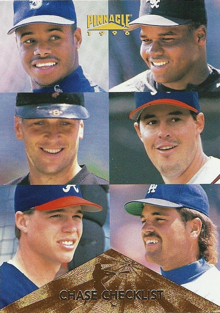
1996 Pinnacle #399 Chase Checklist (w/ Thomas, Ripken, Maddux, Jones, & Piazza)

Okay, what? This thing is bananas. The Kid, the Big Hurt, the Iron Man, Mad Dog, Chipper, and….Mike all on one card? Sure it’s a collage as opposed to a single photo (Select did a fun digital version of this), but it’s kind of awesome in the same way that eating salsa with Doritos is awesome. Yum, but also blech. Too much.

This is the insert checklist which Pinnacle refers to as the “Chase Program Checklist.” Fancy. And it’s really just close-cropped versions of all these guys’ respective base checklists. Hm. I’m so ambivalent about this card I don’t even know what to type. Thank goodness I don’t have the Starburst version as it would probably break my scanner with its heaviness. Let’s move on to the inserts before we hurt ourselves.

The inserts of ’96 Pinnacle are super disco, and by that I mean they are loud and flashy and maybe even a little obnoxious. They’re also pretty damn fun. Take a look:

1996 Pinnacle Power #3

Settle in. We’re gonna talk about this one for a sec.

When I first saw one of these inserts I was 15 - I pulled the Mike Piazza out of a pack and just beheld the crap out of it for minutes on end. I touched and rubbed and felt that thing up like it was taking me to the prom.

To this day it’s one of the most interesting cards texturally that I’ve ever seen. I know that giant ridged holofoil home plate leaps out at you like a cheetah on fire, but it’s not the wildest design feature here – it’s that matte black background. It makes everything that isn’t it explode off the card, into your retinas, and out the back of your skull like a SCUD missile made of gold foil and rainbows.

Take each element on its own: matte black background, soft to the touch and actively annihilating light in any form like a cardboard black hole. The player silhouette, embossed and glossy, lively against the still black. The home plate, ridged like an atomic Ruffle and gleaming from ROY to BIV and everywhere in-between (G). The gold foil, raised in perfect rounded arcs in the text and along the bottom edge of the home plate to give dimension to the great, spectral beast. This is basically an 8.75 square-inch theme park of textures and light effects. If you don’t like it, you probably also don’t like candy or America.

A blind person could spend ten seconds with this card and think, “Damn, that’s pretty baddass.”

I really only have two problems with this card: first, it is extremely tacky. Yeah, I get that. Then again, it’s a baseball card – it can be wild and fun. This is not a family sedan. Modesty be damned.

My second problem, and this one is far worse, is that it damages easily, and it’s all the fault of that matte black stuff I love so much. Apart from the obvious threat of soft edges and white corners, it could potentially be ruined forever with one swipe of even a mildly greasy finger. So don’t eat French fries before handling this card unless you use protection (penny sleeves at least, please).

That was like a whole post right there, wasn’t it? Sorry – I have strong feelings about 1996 Pinnacle Power.

1996 Pinnacle Team Spirit #2

So, yeah. This is the same basic card as Pinnacle Power without the ridges. So go back and read all that stuff I wrote up there, mentally removing everything about the “home plate” element, and you've pretty much got it.

1996 Pinnacle Slugfest #2

Slugfest is kind of the perfect Pinnacle insert: Dufex, obvy, but also lots of eye-catching color, different photos on the front and back, a solid blurb that is related to the title/theme of the insert, and its own logo. Plus it’s just a little over the top - one might say tastefully tacky. That pretty much sums up the 90’s for me.

Here are the Griffeys I need from '96 Pinnacle:

1996 Pinnacle Starburst #41 Artist’s Proof
1996 Pinnacle Starburst #61 The Naturals Artist's Proof
1996 Pinnacle Starburst #155 Hardball Heroes
1996 Pinnacle Starburst #155 Hardball Heroes Artist’s Proof
1996 Pinnacle Starburst #185 300 Series
1996 Pinnacle All-Star Fan Fest #3
1996 Pinnacle Essence of the Game #7
1996 Pinnacle First Rate #1
1996 Pinnacle Skylines #1
1996 Pinnacle Team Pinnacle #6 (w/ Reggie Sanders)

People don’t seem to appreciate Pinnacle this late in their timeline, but I think this is a solid B set. A little tweaking of the nameplate (shoot, just a cool font) would move it into B+/A- territory for me. Am I being too nice?

I can't even complain all that much about the rampant overuse of the same stable of star players on card after card. Frankly I’m impressed at the shamelessness with which Pinnacle padded their checklist. Seven out of the 400 base cards are Griffeys - that’s 1.75%. It doesn’t sound like much, but it is. Their saving grace to your average collector is that the cards are cool; their saving grace to me is that I like Griffeys. Everyone wins.