In my collection: 1 regular, 1 Heavy Metal
Griffey looks: like an astronaut
Is this a good Griffey card? Yes. The first year of Metal Universe, and a great mixture of baseball and science-fiction.
The set: Metal Universe is arguably the high-water mark for creativity in baseball card design. Fleer was owned by famed comic book maker Marvel when this set was created. This means that while most card companies were developing new printing methods, creating fancier borders and fonts, and slapping on multi-faceted gold foil shapes and holograms, Fleer was putting Ken Griffey Jr in outer space. They were dropping Frank Thomas on the edge of an erupting volcano and pitting Hathcliff Slocumb against an army of alien robot spiders.
Now, ask a kid which design philosophy sounds more appealing.
I scanned dozens of cards from this set for your perusal, but I took photos of a select few because they look so much better that way. Let's see a few of these gems:
 |
| Heathcliff battles robot spiders on an alien planet. |
 |
| Carlos races through a trippy fantasy world. |
 |
| Al phases in and out of existence. |
 |
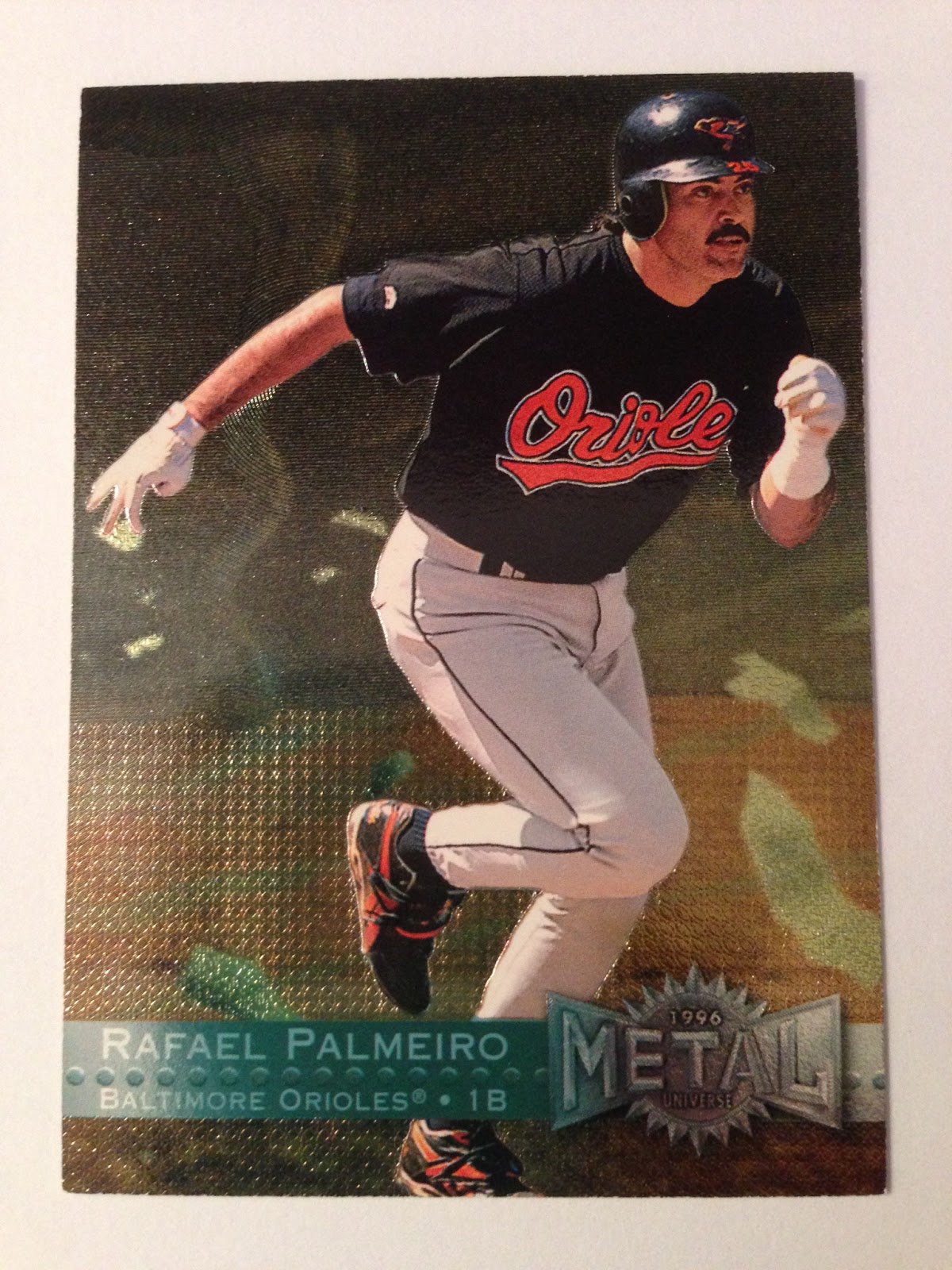
| Raphael evades a tornado. |
 |
| Mike battles a huge robotic claw. |
 |
| Eddie plays in a lightning storm. |
 |
| Kirby cannot be contained! |
 |
| My personal favorite - Alex hangs ten. |
 |
| Vinny dodges the sting of a deadly mega-wasp. Look at the shadows on Vinny's body. Wow. |
 |
| Javy is in a nuclear explosion. Hm - this one's kinda sad. I like Javy. |
 |
| Frank smashes his way out of an active volcano. |
 |
| Jack battles a big eye-tentacled monster thingy....with pitching! |
 |
| Marquis smashes little rockets with his bat and mighty scowl. |
 |
| Al cannot be restrained! |
 |
| Gary disintegrates a steel enemy with baseball moves! |
Here are the scans of nearly all of my Metal Universe cards:

Scans of this set cause the color and names to all but disappear, but you can really make out the intricate texturing. Still, I prefer the photos as this is a really colorful set.
Metal Universe also includes Platinum Parallels which keep the wild texturing but silver out all the background color. The effect is neat, but for the most part the regular looks better.
The Heavy Metal insert might as well have come in any other set. Nothing special. Rivets. It's got rivets.
Platinum Portraits are just as boring as Heavy Metal. Really, you wanted the base cards. Even the Platinums were a disappointment compared to the awesome, awesome base cards.
Here's the Griffey:
Check out the Kid trotting around alien worlds like an astronaut. The sky is loaded with planets, moons and stars like in that one Doctor Who episode where the Daleks steal the Earth. Those Oakleys protect his eyes from cosmic rays, and he uses that specialized glove to catch errant meteoroids that happen through the atmosphere. His stylish Nike "Griffey" moon boots are looking fly.
Here's a camera shot of the same card - this does the colors better justice than the scan:
Lots of different etched foil textures and patterns make up the surrounding planets. I'd love to see the Platinum version to get a better look at them.
Here's that Heavy Metal insert again. Riveting, isn't it? (sorry)
These are the Griffeys of 1996 Metal Universe I don't yet own:
#107 Platinum Parallel
#3 Mother Lode
#3 Titanium
None are particularly valuable. Mother Lode is a pretty sweet-looking insert I look forward to landing someday.
The coolness of Metal universe cannot be overstated. And yet as cool as 1996 Metal Universe was, Fleer would do an even better job in 1997 with more card themes, even wilder designs and more intricate environments. The printing process also got better as they ditched the simple stippling and hatching and went to a cleaner texturing method. Plus I have twice as many 1997 cards to show you. Admit it - you can't wait.
See you then!


Do you have randy myers metal universe card? I believe it is an error card. His jersey and info on the back says Cubs, but under his name on the front says Baltimore Orioles. I cant find any information on the internet.
ReplyDeleteI scanned all my cards for this post, but it looks like '95 was his last year with the Cubbies. He was traded and played with the Orioles for all of 1996. There should be Cubs stats in the stat box on the back but an Orioles logo in the logo spot (bottom-left above the stat box). If it's a Cubs logo in that spot, it's more out-of-date than an outright error, but especially silly since they got the team name correct on the front.
ReplyDelete