
Griffey looks: in a state of begrudging acceptance
Is this a good Griffey card? Yes. It's perhaps the most universally desireable card in an otherwise piss-poor (pun intended) set.
The set: YELLOW.

Here's two of history's greatest southpaw pitchers. That Glavine is in the binder because it's a rare one of a pitcher sliding into home. Way to protect the hands, Tom.

This is in the binder under B for Bonds, but it's a great picture and one of the only cards of two-time World Series champ Mariano Duncan I've held on to.

Looks like a boring old Ripken card from a crappy set in the overproduction era, right? I thought so too until I flipped it over.....

Crazy, right? It's totally real, I assure you. In a set loaded with stupid mistakes, this is a big, honking error. Has anyone else seen one of these wrong back cards? I hear they're not uncommon, but I've never seen another.
Apparently a bunch have surfaced with football on the front and baseball on the back. I wouldn't even waste time calling that an error - that probably falls more under the category of major f**k-up.
God this set sucks.
Here are the Griffeys:
Judging from the man's face, Junior is settling for a walk here. Perhaps it was intentional, perhaps not, but he looks to be in a state of begrudging acceptance about it. The guy's a good sport, even with loose shoelaces.
Can you tell which one of these is the error card?
 |
| The card on the left is considered an error card because.....well, I'm not really sure why. |
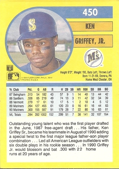
In the blurb they mention Griffey batting "around .300." In actuality he batted .2998324 (179 hits/597 at bats in 1990) which is very much in the vicinity of and rounds up to .300. The problem is that his average is shown as .300 in the stat box which is exactly .300, not around it. Yeah, you heard me - that's the problem.
This is the lamest error in the world. I didn't even believe it until I saw both versions. I mean, is .2998324 not by definition around .300? I'd say that's about as around .300 as a number can get. If you think that every average is going to land exactly within three decimal places every time with all the at bats these guys get, you don't understand math. And I'm all on board for the three-decimal place standardization of batting averages, but semantics at this level are exceptionally ridiculous.
Then, the fact that Fleer went back and fixed the error is a tragedy. It says that someone at Fleer thought enough of the company's embarassment in using the word "around" in the blurb on the bottom of the back of a single card to redo the wording, but they didn't even bother mentioning the fact that nearly every square inch of card space is bright yellow and this is one of the most horrible designs ever put to cardboard. Nope, the word "around" was the reason cards weren't selling. Talk about forest for the trees.
While we're being honest, I kind of like the backs in this set. Color portait, color team logo, color bars in the stats grid. The yellow doesn't even bother me that much because there are, you know, other colors.
 |
| Are you offended by this? I'm more scared of the front. |
Look at these fresh faces:


What a great card. When Barry started slinging them out the park at record pace and the media started going bananas (bananas - yellow. get it? sorry.), I sifted through my collection for Bonds cards to set aside. They would be my baseball card IRA. I'm proud to say none of this card made it out of the Griffey box to the Bonds stack. My desire to keep the Griffeys together was stronger than my desire for wealth.
Griffey gets more words, but Bonds has more records. So who makes this card more desireable? Who had the more storied career? Is all publicity good publicity? This card comes with a lot of questions.


Here is the one bright spot in Fleer's awful product line for '91. I've said it before: there's not enough rainbows on cards anymore. The blurb is solid, and you get 3 color pictures on one card. In all, a great insert for 1991.
I would like to say that the design of the base set isn't really that bad - it's simple but classic and understated, and the photography isn't horrible. It's just so yellow. It's garish and overbearing, and it kills every card it touches. If they rethought the color scheme a bit, '91 Fleer wouldn't be one of the dogs of the overproduction era. This guy agrees with me. Then again, if that happened it wouldn't be known as the yellow police tape set, it would be the "crisis averted" set.
I'm starting to think I'm the only '91 Fleer-lover left in this universe.
ReplyDeleteI like the yellow! It was the 90's and bold colors exemplify the era.
DeleteYou guys should go eat banana slugs together. :-/
DeleteIn all honesty I’ve come around a little bit in the years since I made this post, but I still think the yellow is an odd choice.
I like the design. Its different from everything else
Deletethe card on the left is an error due to the missing "."
DeleteThe "corrected" card looks far worse than the "error"! For some reason, they added an unnecessary blank line above the text, and there are weird spacing issues on the line with the adjusted text. There have been too many Fleer errors from this era that have gone corrected with little notice to make me think that they created a Griffey error card for the sake of drumming up interest, but it's still embarrassing.
ReplyDeleteNick, I'll defend '95 Fleer with you to the death, but this right here is too much yellow! The font and design aren't that bad....nor is the photography. I think this is a better set than '90 Donruss even, but it's still too much freakin' YELLOW....
ReplyDeleteAre any of these banana looking cards worth anything? Especially the Griffey error card, usually those have some value to them
ReplyDelete