
In Donruss' final year as an independent brand they continued their quest to be recognized as an adult set with a simple and modern base design and a host of solid, original inserts. This base set was not extremely popular, but the inserts met every definition of 90's coolness (one in particular continues to break the $100 mark).
Five years earlier a movie came out called Crazy People starring Dudley Moore and Darryl Hannah in which an ad man goes a little nuts and embraces truth in advertising. One of the ads he comes up with is for Volvo, and the tag line he came up with was, well, see for yourself:

There it is. This pretty much sums up 1996 Donruss for me. Let's get around to why:
 |
| 1996 Donruss #338 |
I was excited to bust my first pack of this product right when it came out back in '96. Having been a fan of the Donruss and Leaf designs of the previous year (which were alike), I couldn't wait to see what they'd come up with. Turns out what they'd come up with was a box. A big ol' box.
I should mention before going forward that the top-mounted nameplate looks excellent and doesn't interfere at all with the card photography. No, they left that task up to the large, center-mounted box containing the team, team logo, team city, position, uniform number, and brand name. A lot of stuff in this here box.
I don't hate the box - it's even grown on me - but when I first saw it I was not a fan. It's in an awkward place not unlike the placement of the Topps logo in the 2008 flagship set. Maybe if it had been corner-mounted or something that would have been one thing, but it being right in the center did not sit right with me.
I can even see what they were going for - a clean look that lets the photography do the talking. It's the same direction Upper Deck and Stadium Club had already been exploring. Unfortunately the photography, while in no way bad, just isn't on par with those other brands. I'm thinking someone at Donruss said, "Let's just take all the little things we like to put on the front of the card and stick 'em all in one box to get them out of the way." Then they completely undid everything by putting the box right in the middle.
Let me reiterate that I have come around on the box issue, so me and the box are cool now; but from a design standpoint it is polarizing.

The card back on the other hand is a wonder of cardboard engineering. It's got pretty much everything you could want plus a large color photo. The stats are complete, the blurb is topical, and the large card number is great for set collectors. I'd also like to point out that the card number being on the top-right corner is a huge convenience for the way I like to sort cards. If any professional layout people are reading this, please make that a permanent thing. By the way, how do you become a professional cardbard layout person? Is there a curriculum I should be looking into, or do you just have to be being born with eyes?
 |
| 1996 Donruss #338 Press Proof /2000 |

Not much to this one apart from a little gold foil and a gold tint on the back and in the omni-box.
 |
| 1996 Donruss #490 Checklist |

The checklist is typical as 90's checklists go. It celebrates a specific feat for each player, this one being for Junior's 1000th hit. It's really only 1/3 of a Griffey card in terms of surface area - the rest is all checklist. Ho-hum.
FYI, there is a Press Proof version of this checklist - it has gold foil where there is normally silver, but no "Press Proof" foil stamp. Can't make things too easy.
 |
| 1996 Donruss Elite Series #70 #/10000 |

The Elite Series is back, of course. This is Junior's fourth Elite Series card (not counting the Elite Dominator of 1993 which was sold on the Home Shopping Network), and it's beautiful as always. The Elite Series was characterized by symmetrical designs, center-mounted everything, lots of shiny silver bits, and a fixed print run of 10,000. Much of that would change in '97 following the Pinnacle acquisition, but in '96 those were all still the standards. Despite the Elite Series insert continuing for two additional years, this is the end of an era.
I should really do a design timeline for this entire insert.
 |
| 1996 Donruss Hit List #2 #/5000 |

The large vertical nameplate is deceptively cool here. It seems to react with the background color shades in a very slight way so as not to dominate the design but also remain legible (um, not so much in the scan, though - that papery foil stuff never scans well). The modern font and gold foil logos give it a rich look. And is that an early predecessor to Griffey's Nike Swingman logo?

If it wasn't such a horrible over-the-head swing, I'd say it might be.
 |
| 1996 Donruss Power Alley #10 #/5000 |

Now we're talkin'! This one is widely regarded as one of the quintessential 90's inserts, defining a generation of cards that was out to kill and eat the boring old man cardboard of the past (which would return with a vengeance just a few years later). Another bilaterally symmetrical layout where sharp silver angles and a grid of holograms gleam amid team-colored rows of diamonds. It reminds me of Rainbow Road from Mario Kart.
 |
| 1996 Donruss Power Alley #10 #/5000 Die-Cut #/500 |

This is the Everest of '96 Donruss. The Power Alley insert is numbered to 5000, but the first 500 cards were die-cut making them a rare parallel within the insert. Card values for numbered/limited cards go up exponentially the further back in time you go. This one being limited to only 500 copies and being made so early in the serial-number game make it an eBay darling. There's actually one up for auction as I type this priced at $227. That's not even close to what I paid, but I wouldn't be surprised if it sells in that range.
 |
| 1996 Donruss Round Trippers #6 #/5000 |

Griffey hit 17 home runs in 1995, the same number as Cal Ripken. That's not nearly as many as some of the other guys in this checklist, but he'd have hit a whole lot more were it not for his wrist injury. Donruss knew that. They also knew that making an insert like Round Trippers and not including Junior and Ripken in it would be a bad move being that they were the biggest names in the game, so here we are.
I like Junior's card a lot because I'm super all about sepia on baseball cards, especially with the kind of foil Donruss used here. The angle of Junior's gaze tells us he just hit the butt out of the ball. Then when you flip the card over, he's still looking as he begins his home run trot. The two photos from the same at-bat on opposite sides of the card gives us a kind of flip-book effect. You don't see that often. On the bottom of the card back we get to see current year production versus his career average. This is where they justify his place in the checklist. This section says, "Yeah, he had an off-year due to injury, but homeboy belongs in this insert. Just look at these red bars!"
 |
| 1996 Donruss Showdown #3 #/10000 (w/ Greg Maddux) |

This is one of the first if not the very first serial-numbered Griffey I ever owned. Maybe they thought pitcher-only inserts were lame, so they paired the pitchers up with batters. I have mixed feelings about this, or I would if the insert hadn't turned out so good. We were still a year away from inter-league play, so some of these matchups were fantasies outside of the World Series and the All-Star Game. On top of that, the insert logo and overall design have a fun ying-yang connectivity to them. Something about the small but stately gold foil nameplates always stood out with me, too. A personal favorite.
You may have noticed that staple of Donruss inserts, the Diamond King, suspiciously missing from this post. That's because Junior was not the M's Diamond King in 1995. He was the wrist injury recovery king. Edgar Martinez got the DK honors, hitting a positively stupid .356 and leading the AL in OBP. Oh, and he also got the hit that drove Junior home to defeat the Yankees and bring the Mariners to the AL Championship Series. So there was that.
Here are the Griffeys I still need from 1996 Donruss:
Pre-Production Sample
#490 Checklist Press Proof /2000
Freeze Frame #2 #/5000
Long Ball Leaders #6 #/5000
Now that I have the super-tough Power Alley die-cut, the only remaining cards are relatively inexpensive and available - I just need to get off my butt and track them down. Those are all grey whales at best.
I need to talk about that Long Ball Leaders insert real quick because there seems ot be some confusion. Griffey was card #6 in the insert for both 1996 and 1997. On top of this, Donruss was one of those sets who copyrighted some of their designs the year before their release. Hence the '96 card says 1995 in the copyright line, and the '97 card says 1996. Normally I wouldn't pay much mind to it, but then I saw this:
![1996 Donruss Long Ball Leaders #6 - Ken Griffey Jr. /5000 [PSA 9]](http://img.comc.com/i/Baseball/1996/Donruss-Long-Ball-Leaders/6/Ken-Griffey-Jr.jpg?id=bee7b29c-4a8e-4dd7-871a-90def6777bd7&size=original) |
| on sale @ COMC |
TWICE:
 |
| on sale @ eBay |
This is 1997 Donruss Long Ball Leaders #6, not 1996. PSA has it wrong. Normally I take PSA flips at their word, figuring these guys know what they're talking about. Unfortunately, this does not always seem to be the case. I was pretty taken aback that they would make such an error. Here is the 1996 version:
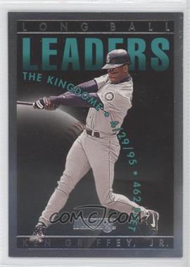 |
| 1996 Donruss Long Ball Leaders #6 #/5000 |
I don't own it, so I had to pull this from COMC, but that's the card. There are a few clues on each card that point to its proper year, but the nail in the coffin is the logo which Donruss changed in 1997 after being acquired by Pinnacle.
According to the PSA population report there are 11 slabbed specimens of the 1996 Long Ball Leaders card, and that's just for the Griffey. Are they are all incorrect? Who knows? If Donruss had simply changed the card number this confusion would not have happened, so I can't really blame PSA for their mistake. But if you're a PSA collector/enthusiast, you might want to go grab one of these errors while you still can. Because if I were PSA, I'd be on the warpath to buy back all of these errors and destroy them.
I really liked 1996 Donruss when I was collecting as a kid. When I'm digging through card boxes and come across these, I usually snap them up.
ReplyDeleteIt's not the box itself that really irks me with '96 Donruss, it's the fact that's chrome and damn near impossible to read at any angle that does it for me.
ReplyDelete'96 Donruss ain't the metallic loin cloth set for nothin'.
ReplyDeleteI was hard core for DonRuss back then, but that 96 box never grew on me.
ReplyDeleteI remember the days of chasing those Press Proofs. I ripped many a pack and only pulled two - and not Dodgers!
Impressive inserts! Love em!
ReplyDeleteDonruss' insert game in the late 90s was on point.
ReplyDeleteFrickin' Rainbow Road.. so beautiful, such a bitch.
ReplyDelete