What a mess this was.
Don't get me wrong - it was also awesome. The cards are great, and I have a whole lot of 'em. And I don’t blame Topps – in fact I love the concept and really love the cards. If you take out all the drama Project 2020 was a huge success and almost certainly had a hand in rejuvenating the cardscape. But things did get a little squirrelly there for a few months.
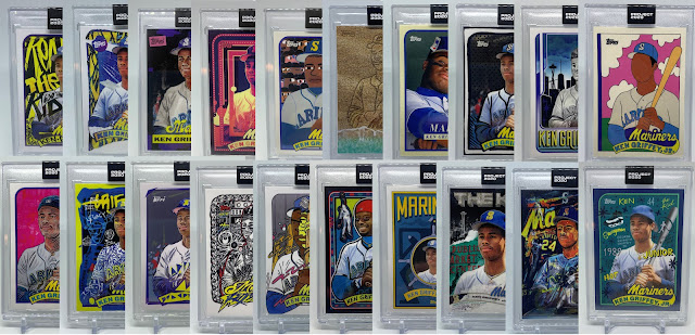
Simply put, the concept was 20 iconic Topps rookie cards each interpreted by 20 artists for a total of 400 "base" cards released a few at a time over the course of the year via direct sale on Topps.com. That means each player got 20 regular cards in the set.
And you could buy as many as you wanted.
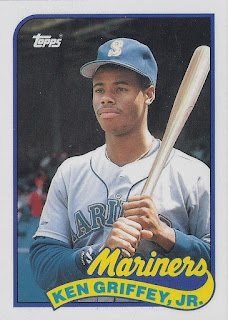
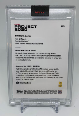
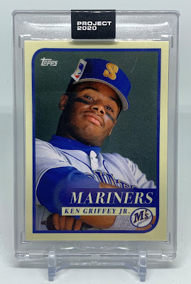
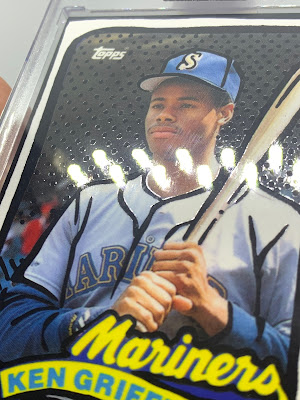
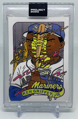
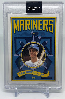
Obviously, Griffey's Project 2020 card is his 1989 Topps Traded #41T rookie card which looks like this:
 |
| You knew dis |
In addition to the regular "base" run there were a few variations. First, each card was available as a #/20 silver-framed Artist's Proof for $100 each, but these typically sold out in seconds. Every regular-card purchase also had a tiny chance to receive the 1/1 gold-framed AP in your order. Then late in the run Topps introduced foil parallels with a print run of 5% of the total regular run which, like the gold 1/1, would arrive randomly as a bonus in your order.
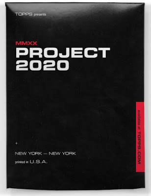 |
| 2020 Topps Project 2020 Envelope |
There were also a few cards that featured randomly-inserted autograph versions the checklist of which included 14 Trouts, a couple of Jeters, and a Frank Thomas, but no Griffey.
NO GRIFFEY.
On top of all this there were a few artist-issued “companion cards” created by the artists to sell independent of the Topps run. These include no player images or team info due to lack of licensing, but they are pretty neat. And who can blame these artists for striking while the iron was hot?
This post is only going to focus on the Griffeys of Project 2020, but we can’t not talk about this card:
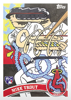 |
| 2020 Topps Project 2020 Mike Trout #4 Ermsy /2910 |
I remember the day Project 2020 began. I bought this card because I just thought it was really cool. A few weeks later they started selling for almost $200, and I liked the idea of having $200 in my pocket more than I liked this card, so I sold it on the spot. Because I am an idiot. A few short days later it was going for well over $1000. It remains a very expensive card to this day.
When you are a collector and the thing you collect suddenly gets hot, you leave yourself open for remorse be it on the part of the buyer or the seller. Looking back I wish I’d held onto it a little longer. Then again, I also wish I’d bought 100 of these things. I’d have paid off my mortgage last year. Also I would have held one back for me because I do still really love the card and wish I had one.
Anyhoo, I never want to talk about this card again, please.
To the Griffeys!
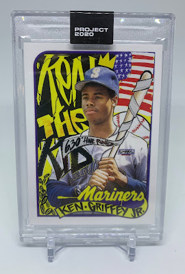 |
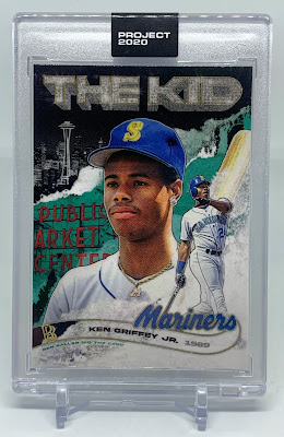
| 2020 Topps Project 2020 #6 King Saladeen /2503 |
This was we Griffey-getters’ first look at what Project 2020 would be, and the reviews were mostly very positive. Personally I remember being really excited about what was to come. It wasn’t my favorite design, but seeing this being released alongside all the other wild, often polarizing designs was exciting. As a result I ended up buying a lot of those first few Project 2020 releases.
As for the design, it’s a bit messy and thrown together, characteristics one wouldn’t normally expect from a baseball card, but that is almost certainly the intention. It’s got an unassuming, homemade quality that I like, and the inspiration of the original 1989 Topps rookie is obvious. The bits I like best about it are the flag, the colors, the general sense of fun and almost total lack of formality. The hand-scrawled, purposefully messy handwriting in the nameplate seemed strange at the time, but not so much now. Like it or not this card set a tone for all the crazy Griffeys still to come.
Being such an early P20 card (I'm going to use "P20" a lot for brevity's sake) and for such a desirable player, this also became one of the more iconic cards from the set. When the market peaked a few weeks after release these were selling for over $800 a pop. Even I considered letting mine go for that. I didn’t, and I’m glad I didn’t for reasons that will become clear later. These continue to sell in the $200-$300 range.
One fact that remained true with just about every card – yes, all 400 of them – is that there were always a couple of guys who just weren’t having it. They insisted the idea was ridiculous or the cards were ugly and used words like “stupid,” “abomination,” “ruining,” "the," and “hobby.” This was even before (and plenty more after) the drama surrounding Project 2020 and its market impact. These guys were talking about the cards themselves, even the really popular ones. I only feel the need to mention it here because they were so vocal about their disgust. I just remember finding it silly to get upset about something so innocuous and that so many people clearly enjoyed. I hope all these fellows are okay now.
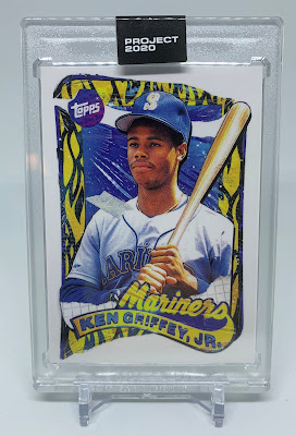 |
| 2020 Topps Project 2020 #25 Tyson Beck /3706 |
This was the first P2020 Griffey I just flat-out didn’t like. It has all the same attributes as the first Project 2020 Griffey, but without the redemptive qualities. It was also selling for hundreds at one point.
I’m gonna go ahead and mention now that the first several Griffeys were kind of weak in the context of what was still to come in both Project 2020 and Project 70. I remember being a bit disappointed by Griffey’s cards while other players were getting all the cool and clever designs.
It was around this time that the secondary market really dug in, and for a while everyone went kind of insane. Prices soared, and no one was really sure why. People started buying more P20 cards specifically to flip into quick and easy profit, and other people actually paid those inflated prices for them. It all seemed too good to be true, and that’s exactly what it was.
When it comes to the market as a whole it was the early cards that were given the most attention in the aftermarket, specifically the first 50 or so. These are the cards that skyrocketed in price for those first few weeks.
This is also the time when I sold nearly all of the early-issue P20 cards I had picked up. I bought the cards because I liked them, but I didn’t like them enough to pass up what people were apparently willing to pay at the time. The ones I sold went for anywhere from $80 to $200 apiece. The funny thing was that if I had waited just one more week to list them, I’d had been able to triple those prices. I still honored every sale in good faith, but I did get a bit of seller’s remorse despite knowing full-well this made no sense and could not possibly endure. In hindsight I’m glad I sold when I did because things were about to get ugly.
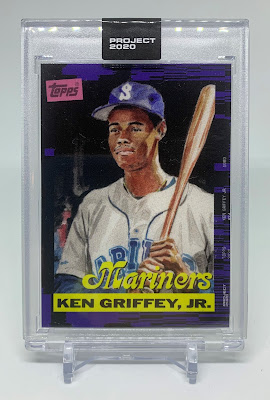 |
| 2020 Topps Project 2020 #53 Matt Taylor /4235 |
I never really cared for this one. It looks unfinished. The painting is nice enough, I like the interplay between the purple and black in the border, and I really like the team name font. I think it's the big, dumb nameplate that's ruining it for me. Matt has some great cards, but this felt like a miss.
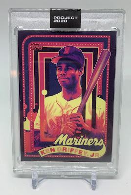 |
| 2020 Topps Project 2020 #66 Jacob Rochester /9535 |
This was among the few bright spots among the early Griffeys, and it was the first one I really liked. Jacob used this same color palette and general aesthetic for all of his cards (most of the artists stuck with a cohesive design/theme). I really love the lettering ala the ‘60 Topps set. Pretty cool card.
Note the massive print run. I assure you 80% of that run was intended for eBay. The Project 2020 glut was upon us. Cue the Keith Shore:
 |
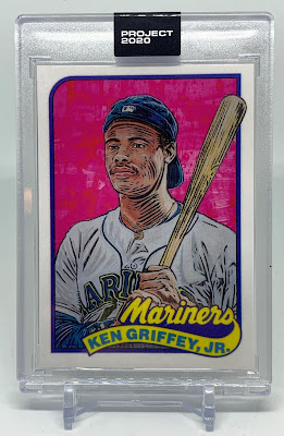
| 2020 Topps Project 2020 #88 Keith Shore /99176 |
Welp, here we are. This card was pretty much the turning point. Everyone thought buying Project 2020 cards was like printing money, and everyone bought LOTS of them. Fortunes were made, and gently-used Camaros were bought. Topps enjoyed just shy of $2 million in revenue from just this one card. To this day they continue to tout this Griffey as the King of Project 2020 based on sales figures alone, and I guess it is. But no, it is not the best Project 2020 card. Not by a long shot.
I bet seeing the final sales figures for the Shore Griffey was a real come-to-Jesus moment for a lot of – ahem – investors. And in case that ridonkulous print run didn’t shake some sense into the market all on its own, some famous-in-cardboard-circles card guy wrote an article that posited that the emperor had no clothes. It all fell apart so fast.
Waves of seller’s remorse were followed mere days later by waves of buyer’s remorse. I’m willing to bet that never before has eBay experienced quite so many sellers cancelling sales followed directly by buyers cancelling purchases. The stories were everywhere. There was a ton of anger and frustration. Suddenly thousands of cards were arriving “damaged” or “not as described” (buyers have far more power than sellers if they don’t mind being a little dishonest). All the worst aspects of the collectibles market were happening all at once. It was a dark time.
Back to the Griffey: the card itself is cute, but it’s hard to look at it at face value and not see a symbol of capitalism run amok. Have you ever heard of the concept of Tulip Mania? I’m willing to bet there were some folks in 17th-Century Holland who never wanted to see another tulip for as long as they lived after that fiasco. The Keith Shore Griffey is the tulip of Project 2020.
All at once a MASSIVE glut of Keith Shore Griffeys (among others) flooded the market, and it was only hours later that you couldn’t give these away. Simultaneously the rest of the P20 market crashed too. Hearts were broken, Camaros repossessed. Keyboard warriors raged. I kind of feel for Keith on this one. He had the honors, and it seemed to have all come down to timing.
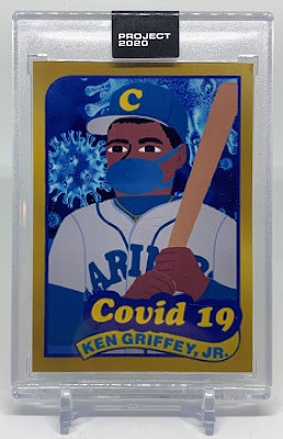 |
| 2020 Topps Project 2020 #88 Keith Shore /99176 Gold-Bordered Covid-19 Custom |
There are also customs. LOTS of customs. THOUSANDS of customs. In an attempt to increase the desirability of those cards with extraordinarily high print runs. Plenty of people bought huge quantities of these cards in the hope of flipping them for a fortune, and when the market crashed they were left with stacks of cards worth less than what they paid (Shores were going for around $3 a pop); so they tried dressing them up like the one you see above. It worked, too - a lot of people made their money back. It was actually pretty fun browsing what people were putting together, but I really liked this one and wanted to have at least one for posterity. This particular custom marked the time especially well.
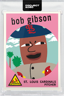 |
| 2020 Project 2020 Bob Gibson #54 Keith Shore |
Anyhoo, the Shore Griffey sells in the $2-$4 range. I bought a dozen of ‘em on COMC for $2.25 a pop just because I could. That’s almost worth it just for the cases.
While we’re talking about the Shore Griffey, why is everyone in the crowd a matador?
 |
| 2020 Topps Project 2020 #116 Don C /10956 |
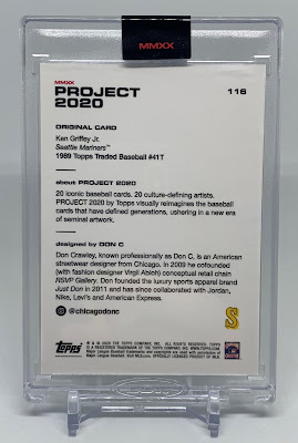
This first Griffey of the post-Shore era was more or less a hit. I only say “less” because there were a handful of people who hated it, but for the most part everyone went nuts, myself included. It’s certainly unique. It’s also thematically on the nose.
I assume the card was designed well before all the wackiness in the market, but it’s kind of the perfect symbol for the time – a depiction of the iconic Topps rookie that, while fun to look at, will soon be swept away like the proverbial love letter in the sand. You can ascribe the metaphor to a great many aspects of Griffey’s career, to Project 2020, or even to life itself. It’s a damn universal truth.
In a literal sense I assume the idea was to recreate the 1989 “wave” design, but you can’t stop this old former English major from reading way too much into it. I really like the colors here, too.
There won’t be too much more in this post about the P20 market because in the span of a couple of weeks things did take a step back towards normality. Production figures (again, based directly on sales) came back down to Earth (though they would still remain much too high) as did prices for all but those first few Project 2020 cards. Folks who didn’t see the crash coming were left with stacks of P20 for which they would never recoup their cost. To this day I’m certain there remain plenty of people with reams of little black envelopes filled with $20-a-pop rectangles of resentment.
I suspect the only hope for those people now is that Topps continues doing these artist sets in perpetuity, they become more and more one of the standards of card collecting, and a decade from now collectors will all be clamoring for cards from that first set. Assuming inflation isn’t too bad (lol), perhaps they could resell them roughly for what they paid.
Of course that will all depend on what Fanatics does with their shiny new Topps properties. It’s going to be an interesting couple of years.
Okay, that pretty much does it for the market talk. We can focus on the cards now.
What a mess.
 |
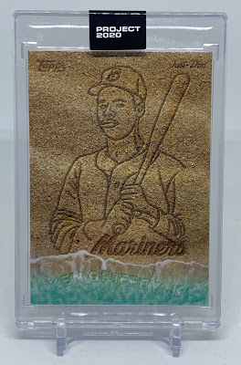
| 2020 Topps Project 2020 #127 Oldmanalan /10471 |
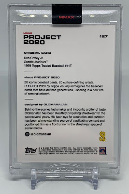
The star of this here show is that photo. This one is kind of the '89 rookie utterly reimagined from the ground-up with about the coolest photograph Mr. Oldman could find. The design itself has the air of a (rather weak) base set design from this era – simple nameplate and design, similar border, clean; and it begs the viewer to focus on the photo which is perfect. I do appreciate that he stuck with the original border. What a rookie card this would have been.
 |
| 2020 Topps Project 2020 #148 Joshua Vides /6020 |
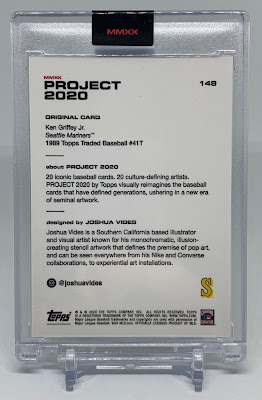
Joshua added shiny, raised black lines to each card. The effect is kinda neat if you’re just looking at an image on a screen, but it hits different in person. The thickness of the ink is apparent in the light, and if you take the card out of the case (which I did), you can really feel it.
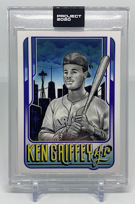 |
| 2020 Topps Project 2020 #177 Mister Cartoon /6526 |
Mr. C gave us a great illustration of a backwards-capped rookie Griffey against a Seattle skyline complete with a bold nameplate in a seriously cool font. The fonts of P20 are some of my favorite parts. Note the shoes hanging on the power lines in the background there. A really fun illustration that is totally original from the ground-up.
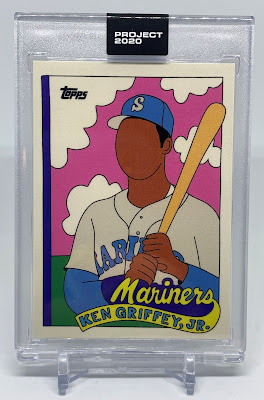 |
| 2020 Topps Project 2020 #201 Fucci /3554 |
I suspect Fucci, aka “The Face-Slayer,” doesn’t know how to draw eyes, noses, or mouths. I’m kidding, of course – one of my favorite artists, Aaron Horkey, is known for, among other things, his faceless owls. I like the pink sky above the verdant field and big, fluffy clouds; and I love that you don’t need facial features to know who is on this card. It’s a little weird, I suppose, to those whose walls are covered in Thomas Kinkade prints and soulless “Live, Laugh, Love” crap, but the arthouse kids eat up this kind of thing.
 |
| 2020 Topps Project 2020 #211 Blake Jamieson /5723 |
Somehow we got two pink skies in a row, this one with a comic book illustration complete with Junior’s signature backwards cap. Blake is really into contouring to the point that The Kid looks a little zebra-ish in parts. I like to think the artists who incorporated the backwards cap into their cards are Griffey fans.
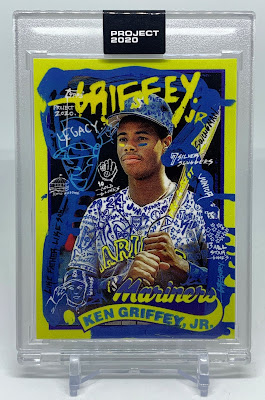 |
| 2020 Topps Project 2020 #231 Gregory Siff /4532 |
Busy, busy, but one of the better busy, busy ones. This one looks like a street artist got ahold of a standard 1989 Tops Traded #41T and dressed it up with graffiti and yellow highlighter. His jersey looks like my 9th grade notebook (I was a doodler), and I’m a fan of the homage to the Griffey father-son lore.
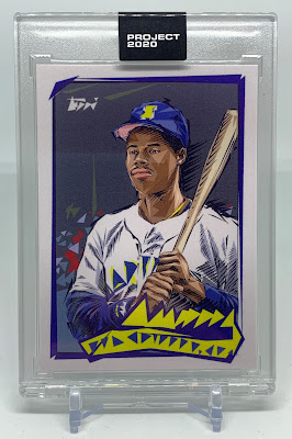 |
| 2020 Topps Project 2020 #257 Naturel /3329 |
This may sound silly, but if I were asked to do a P20 Griffey, this is the design my card would look most similar to. I would be all about the “deconstruction” aesthetic, reducing lines and shapes into much simpler lines and shapes, but just enough that they are still recognizable as the original card when assembled but completely random and meaningless when not. And it reminds me of Seinfeld, Naturel being the "traingles guy" who got the Junior Mint dropped into his abdomen.
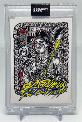 |
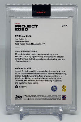
| 2020 Topps Project 2020 #277 JK5 /3354 |
Some of my favorite Project-anything cards are the ones that on first glance make you say, "Geez, look at this thing." JK5's may be the most fun card to spend time looking at - there’s just so much to see. Every square centimeter of this image is intricate tribal tattoo which is pretty impressive all on its own. JK5 put the theme right there on the card: “Hip Hop.” We get what I surmise is Junior as a rapper in what appears to be a recording studio, spitting fire and writing hot rhymes with his giant pencil, all eyez on him. There are plenty of little surprises hidden in the art here, some of which you may need to break out the loupe to see, but it’s worth it. The more you look at this one, the better it gets.
And that is the coolest nameplate, legible or no, in all of P20. Not even close.
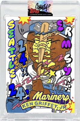
 |
| 2020 Topps Project 2020 #300 Ermsy /4761 |
2020 Topps Project 2020 #300 Ermsy /4761
I love this one. Yes, the lore behind the Trout is part of that. Ever since that Trout hit the streets everyone was waiting for the Ermsy of their favorite player, and he rarely disappointed. This might be the most wacky, whimsical, cartoonish Griffey card ever made. Like, legit Daffy Duck type stuff. Fun to see in the often serious world of sports cards. I once had a headache that felt like this image.
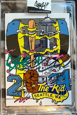
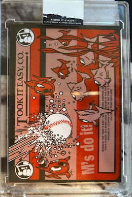
There’s a new term for us all to learn: "companion card.” That would be a card issued directly by an artist independent of but related to their work for a major brand. There were a bunch of these offered throughout the year (and even more the following year) but only a handful of Griffeys, and it's fun to see these artists get creative to avoid licensing issues.
The Ermsy companion Griffey is particularly good. Check out that amazing card back. These were available signed by the artist apparently in different colors, this one being done in green. Tons of fun stuff to look at here. I wish I'd bought one - I had to pick up a lot of these companion card images from eBay.
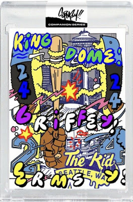
There was also a hand-embellished version (also known as "remarqued" to the art folks) that probably cost a lot more.
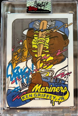
We're still not done. There are also signed and remarqued versions of Ermsy's base P20 card that look like this:

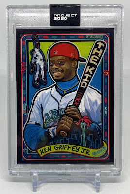 |
| 2020 Topps Project 2020 #317 Efdot /3561 |
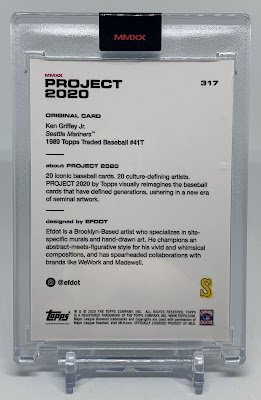
2020 Topps Project 2020 #317 Efdot /3561
You are looking a perfect recreation of the window above the altar in the church of Griffey. While it is a little clash-y, I do appreciate the backwards reds cap here. This is almost a Gallery of Heroes card. Great colors.
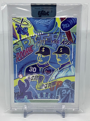 |
| 2020 Topps Project 2020 Efdot Ken Griffey, Jr. Companion Card #/100 (w/ Ken, Sr.) |
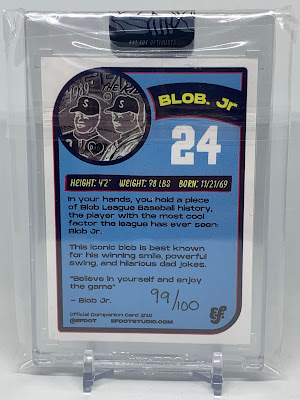
This is the only companion card I managed to grab. Ef. did a great job making this one a distinctly Griffey card without resorting to obvious likenesses or logos. Note the carefully-crafted "Blob" verbiage in the blurb. The faces as well as the father-son references here remind me a lot of those from the Gregory Siff P20 card.
 |
| 2020 Topps Project 2020 #328 Grotesk /2744 |
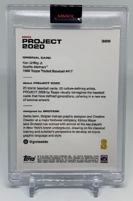
This card has a real Gilligan’s Island/Popeye/The Love Boat energy about it. We get Junior’s ’89 Topps Traded portrait in a ship’s wheel all opening-credits-style with a giant “Mariners” emblazoned across the top like that’s the name of the show and Griffey is a character. Also it wasn’t until I really focused that I noticed the little man driving the boat who I’m going to call “The Skipper.” How did I originally miss that?
The fonts are great as is the nameplate swoosh from the ’89 card; but while not necessarily ugly, this card is far and away the weirdest Griffey of Project 2020. It’s also got the second-lowest production figure, surpassed only by that very first Griffey.
We are down to the last three, and I’ll let you know right now: all of them are absolute bangers. This is definitely my favorite part of the Griffey checklist.
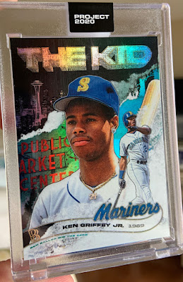
 |
| 2020 Topps Project 2020 #347 Ben Baller /10753 |
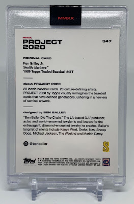
All Ben’s designs look like ‘90’s rap album covers in the most complimentary possible. Topps currently has Snoop Dogg designing cards for Project 70, and even his designs aren’t as ‘90’s hip-hop as some of Ben’s.
That said, as far as that hip-hop-album-cover aesthetic goes Junior’s card is actually pretty toned down. Sure, we got a giant blinged-out “The Kid” up top in the spirit of Big Tymers and Hot Boyz, but little else here screams “Uhh UHHHN na-na, na-na” quite as much as that part.
Now if he was crouching on the hood of an Impala fanning out $100’s, all iced out with a solid-gold AK on his hip, surrounded by big-bootied ho's spread-eagle in bikinis, that would be another story. I would pay $100 for such a card, btw.
But yeah, overall it’s a colorful, attractive card. I really love the nameplate here, and that’s some great Seattle imagery. It’s no surprise this one had such a large print run.
 |
| 2020 Topps Project 2020 #347 Ben Baller Foil /566 |
 |
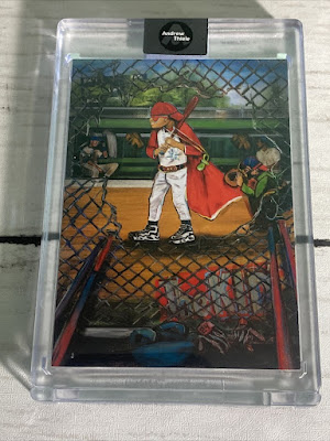
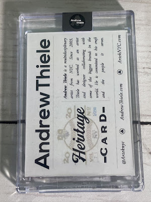
| 2020 Topps Project 2020 #373 Andrew Thiele /3057 |
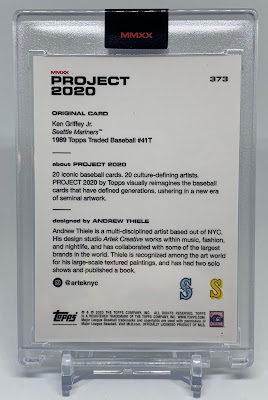
I haven’t sat down and ranked my favorite P20 Griffeys, but if I did this may very well be #1 on the list. The design is great: colorful, warm, full-bleed, and larger than life. It manages to look bigger than the 2.5”x3.5” card it is. The visible brushstrokes give the appearance of motion, and it's colorful without being cartoonish. Another card with plenty of little treats hidden in the image if you look hard enough.
This card was not available in a foil version, and I have no idea why. There is a companion card, though:
 |
| 2020 Topps Project 2020 Andrew Thiele Heritage Companion Card #/250 |
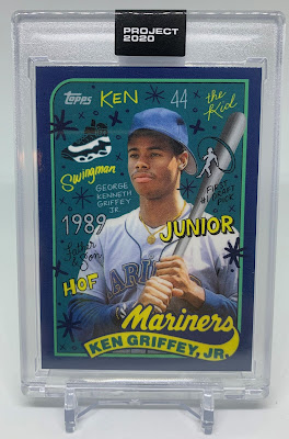 |
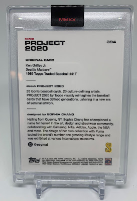
| 2020 Topps Project 2020 #394 Sophia Chang /3839 |
One of my favorites. I love the distinctly Mariners colors, that cool navy blue border with green inner border, and all the images and words in various fonts strewn about the card. She even flipped his cap around! My kinda gal.
Obviously the "44" at the top is a reference to the fact that Griffey homered in a whopping 44 different ballparks in his storied career. Because when you think of Griffey, "44" is the number that immediately springs to mind. Obviously. Ahem.
I mean, come on, it's ON THE SHOE less than an inch away. At least she flipped the cap around, but still. Bruh.
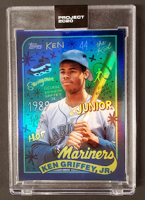 |
| 2020 Topps Project 2020 #394 Sophia Chang Foil /203 |
My favorite of the two foil Griffeys and the rarer of the two. That dark blue looks so damn good in holofoil. Again, I don't have one - I got this from eBay.
 |
| 2020 Topps Project 2020 Nolan Ryan #397 Keith Shore /4187 (cameo) |
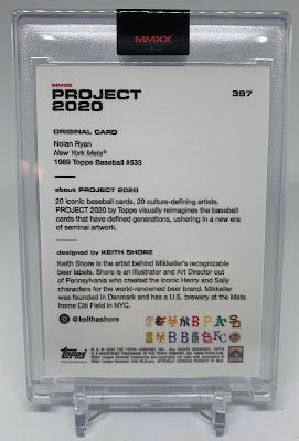
With a print run almost 25 times smaller than that of his Griffey card you may assume this one is just not as good as Shore’s Griffey card. That is not the case – this card is fantastic. It features all 19 other P20 players as depicted in their respective Shore cards sitting in the stands behind him. And check out all the team logos on the back. Just a fantastic card and the most recently-released cameo to date.
Bob Gibson's big ol' thumb head chillin on the right there. Man that thing is weird.
Project 2020 was followed in 2021 by Project 70, a reference to Topps' 70th anniversary. Same basic idea, different color envelope. I'll do another post about those eventually, but not right away. This was a lot of work.
As for Project 2020, though, that's pretty much it. There are probably some companion cards I missed, but there's plenty enough to look at here. And the images are nearly all photos, not scans, so they're all huge. This post probably took a long time to load. I hope you were on wifi.
For a while after Project 2020 things were looking fantastic for Topps from a business perspective. Sales were confusingly high, they were flush with investment capital, and they were getting ready to go public. Then in late August 2021 all that came to a grinding halt when both the MLB and the players union broadsided the brand by announcing the end of their licensing with Topps, a 70-year business relationship.
Then just days before this writing Fanatics, the company that won the licensing, announced they would be buying out Topps which means we may yet continue to see more Project-whatever cards for years to come. Or it may all stop next year. Who knows? Personally I hope it keeps going. The cards are really fun when not surrounded by market drama. Fingers crossed....
Thanks for reading.
Whhhhew that's a lot to take in. But they all good great together, don't they? I have the full run of 20 Jeters (no foils or anything) and they look terrific all together.
ReplyDeleteI picked up a few of these including some directly from Topps... but stayed away from majority of the artists. My focus were on specific Chang and Ermsy cards of PC guys. But like you... I picked up some singles of others on COMC when I could find them at clearance prices.
ReplyDelete