
Old sets are right in my wheelhouse, but this post took a while to put together for one simple reason: I want everyone to like this set as much as I do. Massively overproduced as it was, '92 Donruss is a gem of the early 90's, especially when you look at it in the context of the Donruss designs that preceded it. This was a brand trying to reinvent itself, and this was meant to be the set that laid the groundwork.
It’s hard to
tell whether Donruss' fundamental design change happened in reaction to Upper Deck’s
success or if it happened organically. Donruss was 12 years into the card
business, after all, and its clients were growing up. What we see in 1992 is a
more mature product and design than ever before. Clean lines, limited colors,
and high-end paper stock brought an air of maturity and worldliness. Donruss
had gotten its pubes, and it was time to show them off.
Whether the
change can be attributed directly to Upper Deck’s success is up for debate. At this
point everybody was moving to higher-quality white paper stock and two-sided,
full-color printing. In my opinion, these were upgrades that were long overdue
anyway, and improvements in printing allowed for better quality cards to be
made at lower cost. Cards like this were inevitable. You can't put it all on Upper Deck.
The design itself is dominated by a horizontal strip of light blue along the top and bottom of
the card with the player name in a thick, heavily-shadowed font along the
bottom. The letters are a prominent matte silver that resembles the part of a
scratch-off you rub with a coin. I’m not normally crazy about monochromatic
designs (’91 Fleer, ’90 Donruss, ‘01 Topps to name a few), but that blue is
just muted enough to not be inappropriate for all teams.
The cards
are advertised as glossy, but it’s funny what was considered glossy in 1992
considering ’93 Flair which featured what may be the glossiest surface ever
created by science came out just a year later and glossed everyone’s eyes out.
I will say that ’92 Donruss is smooth and sharp - there is definitely quality
here.
The Donruss
logo is different this year, too, in that it isn’t there at all - just the year
and brand written in tastefully spaced-out letters along the top banner. I like
to think this was meant to class up the design and signal Donruss’
transformation into a more modern look.
That quality extends to more than just the cards themselves: the photography in this set is
some of the best Donruss ever had. I didn’t really know this until recently
when I happened upon a pair of boxes, one from each series, priced at five bucks each
from my LCS. The quantity of great shots I came across while flipping through
those packs blew my mind. Here are a few from that stack I set aside just for
this post:
 |
| Awesome action |
 |
| Bonkers batting |
 |
| Harrowing hitting |
 |
| Captivating catching |
 |
| Precocious pitching |

 |
| And a whole lot of ragin' Rated Rookies |
This is some solid photography, guys, even by today's standards; and the Rated Rookie portraits are everything I
wish they had been back in ’89. I guess I always overlooked the photography in
this brand because it’s right in the middle of the overproduction era. Never
again. Donruss’ attempt at self-improvement is a hit with me.
Nothing
signals the change Donruss was going through more than their new card back.
There’s a lot going on here, so let’s look at a side-by-side comparison with
the back of the previous year’s base set:

At first
glance it’s like night and day, right? Look again. Notice that every aspect of
the previous card back has been feng-shui’d into the new design, including
Donruss-only favorites like the full name and contract status. No other brand
took their modernization this far and with this much detail. In that respect
this is arguably the greatest card back Donruss ever produced.
And did I mention the massive, full-color portrait that fades into the stat box? Did I need to?
And did I mention the massive, full-color portrait that fades into the stat box? Did I need to?
After this
year the full player name would disappear from the card backs, and the
contract status would stick around for one more set only to be completely done away with by ’94. The
only part that would stay is the stat box and player details, but with all the fun exclusives gone there was no
comparative advantage left to set Donruss apart. They gave up a little bit of their identity each year after this. To me, '92 is the last true Donruss set.
OK, let’s
get down and dirty:
|
| 1992 Donruss #165 |

Here’s a
bright, sunny day game shot. Looks like a ground ball to second almost
certainly sneaking by some unsuspecting infielders into right center. That’s
just how Junior rolls.
Lucky for us they still had the full player name this year. I wish Donruss hadn’t
missed the boat on including Chipper Jones in this set – the whole Larry thing
would have blown my 11-year-old mind.
 |
| 1992 Donruss #24 All-Star |

I’ve been
praising this set a lot, but Junior’s all-star card feels awkwardly-framed,
badly-lit, and you can barely see his face (though what you can see is showing some mad focus, y'all). It looks like they were going for
the candid action shot of Junior taking a lead off the bag, an idea that is
much better-executed on other cards in the set.
Donruss went
hard into the promotional market this year, making for some sweet branded oddballs. Check it:
 |
| 1992 Donruss McDonald's MVP #22 |

This
McDonald’s MVP card has a great action pic featuring the Kid maintaining a
concentrated gaze despite being in a very compromised position balance-wise. In
addition to having a superior photo compared with both Griffey base cards, the unique matte gold lettering instead of silver and an MVP logo that is not
ostentatious about its fast food pedigree make this a pretty solid oddball. I’m
lovin’ it.

Mickey D's wasn't the only company to get in on the baseball card craze with Donruss. These Cracker Jack minis are actually really high-quality with designs kept as faithful as possible to the regular base design for being so tiny. They feature a different photo than the original base card and a reasonably functional back tailor-made for smallness.

“Toy Surprise.” Surprise! It’s not a toy – it’s a card. Cards aren’t toys; but thank you, Cracker Jack marketing department, for getting with Donruss and making these cool little things happen.
 |
| 1992 Donruss Cracker Jack Mini #12 |
Mickey D's wasn't the only company to get in on the baseball card craze with Donruss. These Cracker Jack minis are actually really high-quality with designs kept as faithful as possible to the regular base design for being so tiny. They feature a different photo than the original base card and a reasonably functional back tailor-made for smallness.
 |
| 1992 Donruss Cracker Jack Mini Wrappers |
“Toy Surprise.” Surprise! It’s not a toy – it’s a card. Cards aren’t toys; but thank you, Cracker Jack marketing department, for getting with Donruss and making these cool little things happen.
While the cards inside are identical, you’re better believe that different wrapper is a variant.
The Diamond King for the Mariners this year went to Randy Johnson. I like the Big Unit, so I’m not going to besmirch this choice (cough, All-Star Game MVP, ahem), but there is one card from the Diamond Kings insert that needs to be shown:
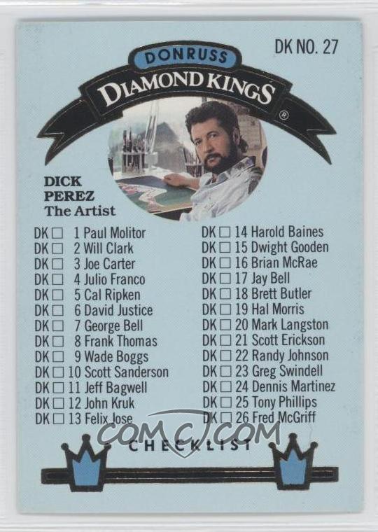
Yes, this is lifted from COMC. Mine is filed away, and I don't feel like digging it out at this moment. You get the idea...
There he is: Dick Perez himself. DP is a legend in the card collecting community for his polarizing player art. From the majorly tripped-out backgrounds of 80’s and 90’s Donruss to the questionable-at-best blotchiness of 2006 Allen & Ginter Dick Perez Collection zombie Griffey, we all have some kind of opinion of Mr. Perez. Like him or not, his work is fun to talk about.
There he is: Dick Perez himself. DP is a legend in the card collecting community for his polarizing player art. From the majorly tripped-out backgrounds of 80’s and 90’s Donruss to the questionable-at-best blotchiness of 2006 Allen & Ginter Dick Perez Collection zombie Griffey, we all have some kind of opinion of Mr. Perez. Like him or not, his work is fun to talk about.
 |
| One of the better generations of DK designs, though the checklist could use some tweaking |
Diamond
Kings inserts appeared in boxes at around four hits per (though I managed to pull
five from one box). Still, imagine being a kid and saving up your allowance for
weeks until you finally have enough for an entire box of ’92 blue only to pull
a DK checklist featuring Dick Perez’ bearded mug. I would have thrown a major
hissy, but as an adult I cherish that card.
I should go
ahead and mention here a common mistake made among collectors:

See this? The back of this card indicates it is from 1992, but this is really the Diamond King from the 1993 Donruss base set. The closest to a Diamond Kings insert Griffey got in ’92 was the Gallery of Heroes from Triple Play. I, too, am guilty of this mistake. You can’t always count on the copyright year (especially with Collector’s Choice and mid-90’s Score). Griffey collectors, update your checklists.
Oh, and this year's Donruss set featured a Rod Carew
Puzzle. Yes, I have the whole thing, but I won't be showing it here as that would entail me popping out the little pieces and putting the thing together, then finding a way to store said assembled puzzle. All respect to Mr. Carew, but no thank you.
Here are the
Griffeys I need from 1992 Donruss:
Promo #7
Elite #13
#/10,000
Leaf Preview
#24
The stated odds of that Elite insert give something remarkable away about this set (and other sets from
this period). At 10,000 copies of each of ten Elite Series cards plus 7,500 of
the Rickey Henderson multiplied by stated odds of one Elite card per 55 boxes (according to Baseballcardpedia),
we can extrapolate the number of boxes of this product to be 5,912,500. That's a hair shy of 3 B-B-Billion cards. This is
the bottom number as it’s not clear whether those odds include jumbos. There
could be considerably more.
Let’s take
this even further: Each card is 3.5” at its longest point. At 504 cards per
box, that’s 1,764 inches of card per box which totals 10,429,650,000”. The
Equator measures 1,558,010,995.2 inches around. This means you can lay out all
the 1992 Donruss cards ever produced end-to-end around the world almost seven
times. That’s just one set from the overproduction era. I think this may have a
little to do with why some people hate ’92 Donruss. There’s far too much of it
on this planet. Remember
that stat next time you feel guilty about throwing away a bunch of junk wax.
Then again,
the more you throw away, the more my ’92 Donruss cards are worth.
Thanks for reading! Coming soon: two boxes of 1992 Donruss Series 1 and 2.
Thanks for reading! Coming soon: two boxes of 1992 Donruss Series 1 and 2.
Great post! The Diamond Kinds did have a nice look in that set.
ReplyDeleteI've started to come around on '92 Donruss these past few months. There really are some fantastic cards in this set. I just put that lovingly off-center Vince Coleman in my Just Commons cart.
ReplyDeleteI love that one, too. I keep a few in my photo box.
DeleteThis is a cool set. I've always loved the Tino RR and the Bernie with the Dwight Schrute glasses and bat flip.
ReplyDeleteI had no idea those Cracker Jack Donruss mini existed. Those are awesome. My mother-in-law just gave me a bunch of boxes of Cracker Jacks she had in her house, and the prize is a lame team logo sticker. I want mini cards.
I only realized a few months ago, while sorting my collection that I did the exact same mistake with a Diamond King insert (Joe Carter's I think). Thought it was 93, but nope. Great post anyway ! I hardly have any 92 Donruss, so they all look new to me
ReplyDeleteI liked that when I first got some packs of it in 1992 - thought it was a 'game changer' as far as flagship cards were concerned.
ReplyDeleteThe DK inserts are still nice even if the cards aren't worth much.
Great post. I know it's a few years old now but no one has mentioned the gold/bronze bordered Coke parallels. I believe there was 2 or 3 cards per 12 pack.
ReplyDeleteI've seen those but weren't they only Nolan Ryan?
DeleteThis was the first set I tried putting together. I'm a checklist shy of completion.
ReplyDeleteI also just found out recently there is an update set..