
How have I not done a post about 1995 Pinnacle?
There is no more characteristically 90’s a brand than Pinnacle, and their 1995 offering is about as ‘90’s as hella-ugly pants, Teenage Mutant Ninja Turtles cartoons, and Zima (oh, wait – all of those are back now).
While I’m a huge fan of the 1994 design and an admitted 1996 Pinnacle apologist, I think 1995 is the high-water mark of this brand as a whole. This is the year the card design was perfected, the photography was popping, and the inserts were just starting to get really cool. The inserts did get cooler in coming sets, but 1995 had plenty enough textured foil and Dufex to go around. Don’t even stress, dog.
Gonna just jump right in here:
 |
| 1995 Pinnacle #128 |
Photography was popping? Get it?
When I pulled this card from a pack in 1995 it booked for $3.00 in the Beckett, but you’d have thought I pulled a $100 card because LOOK AT IT. This is on the short list of the greatest
And yeah, the giant Frank Thomas climbing into the stadium was great, too, as were the numerous triple-exposures and that amazing Ozzie Smith-doing-a-flip card; but look at The Kid, doing Kid things, winning all our hearts. This is the kind of photo brands needed to put out there to overcome that pesky baseball strike and get everyone loving their favorite players again.
I know what you’re thinking – Kurt Bevacqua did it better. Oh, did he? DID HE??

Okay, that’s pretty close – I admit it. Junior’s bubble is perfect – like, too perfect. Maybe a bit…balloonish? Let’s stop here lest we ruin this card forever.
You know what’s just as good as that photo? That background. That is straight-up Junior’s locker, folks. Finally an inside look into the Kid’s day-to-day. Now, I for one like to ponder the logistical side of baseball cards. For example, with this card I have to wonder whether they just up and took this photo or if there was a little set dressing involved. Those Nike Air and Bazooka logos seem a little too perfectly placed. And who takes the time to completely wrap their spray deodorant in tape lest a single logo be visible? And the massive quantity of signed balls, the perfect placement of the wristband with the 24 visible, and is that Junior’s Sports Illusrated for Kids card? And in a case, no less? No cologne, no underwear, no ear medicine or antifungal cream. It all just seems a little perfect. Whatever - I’ll take perfect.
So generally speaking we have a set with stunning photography and a shiny gold baseball seam nameplate that translates beautifully to a horizontal layout. So far I’m sold, but what can you show me in a card back, ‘95 Pinnacle?

The card back is gorgeously 90’s, too – all busy and brimming with personality. Card backs nowadays are all clean and orderly, but this mess with its full-bleed design, TWO excellent photos, shamelessly pro-Griffey blurb, and abbreviated but highly informative stat box is EVERYTHING. Also that portrait on the back makes two backwards caps on one card. Recognize.
 |
| 1995 Pinnacle #128 Museum Collection |

1995 Pinnacle has two parallels, and this is the one that makes sense. It’s the same exact card but in Dufex, and it is mind-bogglingly beautiful. The following year Museum Collection would morph into Starburst, an insert with most of the attributes of a parallel. Lucky for us, in both 1994 and 1995 it was still a true parallel – every base card got one, including a PC of mine, Mariners catcher Dan Wilson, who would probably otherwise never have gotten a Dufex card. And they look killer. I think Pinnacle’s Museum Collection is on the short list of the greatest parallels of all time.
 |
| 1995 Pinnacle #128 Artist's Proof |

I’m just going to come right out and say it: the one-per-box Artist’s Proof parallel is weird. It was weird in 1994 and it’s weird again this year. First off it’s rare – nine times rarer than its far more attractive counterpart Museum Collection. The only differences between the AP’s and the regular base cards are the little foil “Artist’s Proof” stamp and the color of the foil which is a light pewter rather than gold. That’s it.
The Griffey base cards in this parallel consistently break the $40-$50 mark (and there’s one that tends to break three figures), but in no way do they look the part. It can be hard to justify the extra expense to acquire these. Trust me – I know. All of these AP cards appear on the 1996 Beckett Tribute Checklist, so I had to get them. Every. One.
The following year the Artist’s Proof parallel would only apply to the cards of the Starburst insert (again, which was more like a parallel). In lieu of a simple foil stamp and no Dufex, Pinnacle used the Dufex already on the Starburst cards and stamped “Artist’s Proof” right into it repeatedly on diagonals. Pinnacle fixed the value-added aspect of the parallel, but your options were limited to only those players who got Starburst cards (and Junior got like four), so your lesser-known PC players didn’t have one. I’m not sure Pinnacle ever got Artist’s Proof 100% right.
It should be noted that there have been “backdoored” 1995 Artist’s Proof prototypes that have made it out into the market following Pinnacle’s bankruptcy. Instead of pewter foil, these rare prototypes have gold holofoil; and yes, they really do look like the rare, expensive parallel that they’re supposed to be. I have a handful for other players but none of the Griffeys. I do plan on acquiring one someday. Whoever made the call to go with the pewter over the holofoil can kiss my grits.
 |
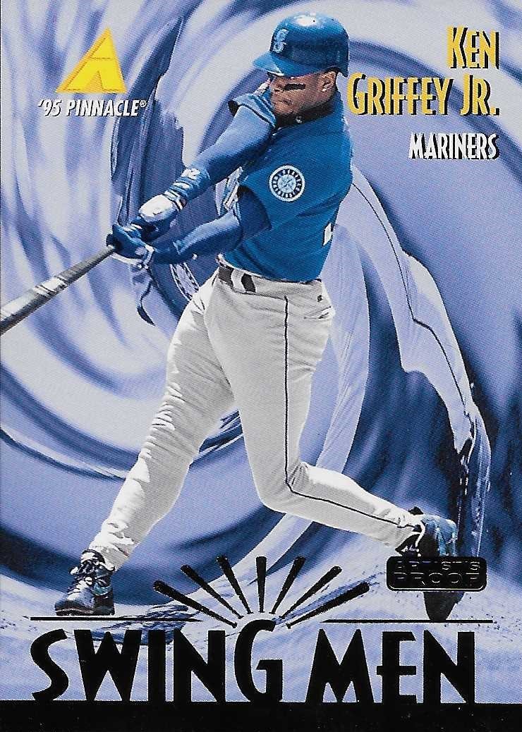
| 1995 Pinnacle #304 Swing Men |
YES. Here is one of my favorite subsets of the ‘90’s. All gold and blue and swirly – these could have been a moderately rare insert, and I would have been all over ‘em. The shape of the swirl itself is more suggestive of a golf swing (to which Junior is no stranger), but I love the effect here. It’s almost like this is a surfing card and he’s shooting the curl. The logo and foil shadow are also excellent touches.
And to those of you who think it looks like they’re flushing him down the toilet I say LOL and GTFO.

The back is pretty solid as well with a curved pattern formed by real photographed bats framing a large portrait. The blurb is clunky and reads like it was written by a 15-year-old; but it also gushes Griffey-love, so you better believe I’m hella ‘bout it.
But wait – this card was absolutely made for the Museum Collection parallel:
 |
| 1995 Pinnacle #304 Swing Men Museum Collection |

Okay, look – I don’t want to sound like a cliquey, Griffey-snob exclusionist, but real talk: your Griffey collection is incomplete without 1995 Pinnacle Swing Men Museum Collection. Thing is TWO BUCKS on COMC right now. You have no excuse. Write it down.
 |
| 1995 Pinnacle #304 Swing Men Artist's Proof |

Yeah, yeah, boring parallel, yada yada yada. Swing Men is still the BEST.
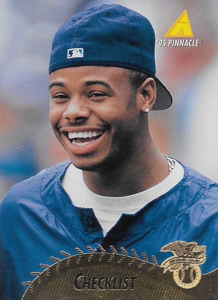 |
| 1995 Pinnacle #447 Checklist |
 |
| I think this is actually the back of the AP version, but it doesn't really matter unless you know what to look for. |
Pinnacle (the Score brands in general, really) were masters of padding their checklists with superstars by featuring them on checklists. Not that I’m complaining, but I absolutely would if they hadn’t done such a great job at it. The photo is very similar to the one on the back of his base card, but come on. Check out this smiley, backwards-capped, 25-year-old millionaire. Man, what am I even doing with my life?
 |
| 1995 Pinnacle #447 Checklist Museum Collection |

That’s the shiny version.
 |
| 1995 Pinnacle #447 Checklist Artist's Proof |

And that’s the overpriced version. Yes, even this, a checklist, will still set you back somewhere in the $20-$40 range if you want the Griffey. Sounds like a lot, but there’s still one AP left in this set, and it’s way more expensive than this one.
 |
| 1995 Pinnacle #450 Checklist |

The last card numerically in 1995 Pinnacle’s base set is this checklist which has officially gone a whopping four-for-four on Hall of Famers. The photos are those from each player’s respective checklist so they’re not new; and this base card is anything but scarce, so it’s not a tough get until you start stacking parallels.
 |
| 1995 Pinnacle #450 Checklist Museum Collection |

This card tends to command more than the same parallel of Junior’s amazing base card all thanks to the additional HOF’ers. And it does look better, as a parallel should. This next one on the other hand…
 |
| 1995 Pinnacle #450 Checklist Artist's Proof |

This checklist is far and away the most expensive and difficult Griffey card in 1995 Pinnacle. Let me repeat that: this CHECKLIST is the Griffey grail of 1995 Pinnacle. If you want one at auction, don’t be surprised if you surpass the $100 mark and, depending on the competition, battle player collectors of those other three guys up into the realm of heavy overspending. I suspect most of these already have homes in various collections, so they don’t come up a lot. I had to wait two years just for an opportunity on this one.
Again, it’s totally not worth it at all because this parallel is lame; but dammit, I had a checklist to complete. So here it is.
That’s all the regular Griffey base cards and their parallels. It took me a long time to amass all these, so forgive me a moment as I gaze at the wonderfully complete base checklist from THE BEAST:
1995 Pinnacle #128
1995 Pinnacle #128 Museum Collection
1995 Pinnacle #128 Artist's Proof
1995 Pinnacle #304 Swing Men
1995 Pinnacle #304 Swing Men Museum Collection
1995 Pinnacle #304 Swing Men Artist's Proof
1995 Pinnacle #447 Checklist
1995 Pinnacle #447 Checklist Museum Collection
1995 Pinnacle #447 Checklist Artist’s Proof
1995 Pinnacle #450 Checklist (w/ Piazza, Thomas, Bagwell)
1995 Pinnacle #450 Checklist Museum Collection (w/ Piazza, Thomas, Bagwell)
1995 Pinnacle #450 Checklist (w/ Piazza, Thomas, Bagwell) Artist’s Proof
Oh, man. That feels nice. In the next post we’ll tackle the inserts and Griffey cameos of 1995 Pinnacle.
Thanks for reading!
I don't think I'll ever understand Artist's Proof cards. They just were never very interesting.
ReplyDeleteHell yeah, '95 Pinnacle is best Pinnacle! I love seeing all of the versions at once here.
ReplyDeleteMid 90's Pinnacle utilized too much gold foil for my liking... but I gotta admit the dufex parallels were pretty sweet. 1998 Pinnacle was my favorite Pinnacle set during the 90's. If I remember correctly... it had some nice photography as well.
ReplyDelete