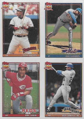
I don't think Topps made a more iconic flagship set in the '90's than this one. And it's not just the photography, although that did take a huge leap forward, too. I always assumed the introduction of Stadium Club had something to do that. Many of these images would be right at home on a Stadium Club card.
But apart from that, there's still a whole lot to '91 Topps that bears discussion.
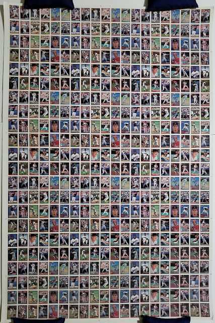
First of all it’s huge – 792 cards, or six sheets of 132 cards instead of five as had been the norm for years of Topps base sets. By 1994 this number would be reduced by half.
Second, this was a set of “lasts” for Topps base sets: the last wax packs that were actually wax, the last use of grey cardboard stock in a Topps flagship base set, and the last pack-pulled gum. All of these would make a return in some form or another in later sets, but when they would it would be as a “vintage” gimmick. 1991 was the last time any of these were done in earnest.
Third, it’s loaded with uncorrected errors and misprints. We’re not talking big stuff like the star rookie’s name missing from the front of the card. Simple stuff like missing parentheses and misprinted stats or numbers here and there. Nothing terribly desirable – it’s just a quirk. And people seem to find more of them in this set every year.
And from a collecting standpoint I can’t think of a single pre-parallel-era base card with more variations, intentional or not, than those from 1991 Topps. Even if you don’t count the numerous errors and misprints there are still a ton to track down. And some of them get pretty pricey.
That said there are worse base sets to have numerous variations of.
As for the design, the thin, dual team-colored borders and team logo are nothing out of the ordinary for Topps. The nameplate as well as the lettering within is particularly small by Topps standards, but still more legible than that of the 2021 design which is just a squint-fest for old men like me. I legitimately still don’t know a lot of these new guys’ names for that very reason (not being able to find packs in the stores didn’t help, either).
While the names were a little less legible than normal, the Topps logo was more noticeable than ever. Topps gave us a big, full-color 40th anniversary logo on every base card, front and back.
On top of that Topps did something very cool for their 40th anniversary: they gave away complete base sets of all their cards going back to 1951, including a grand prize of one of EVERY complete Topps base set, including the 1952 set. They were meted out through seeded buyback cards, redemption/instant win cards, and contest cards.
This contest has stuck with me to this day. Even though I was barely into cards at all yet I still remember seeing the commercials and being totally blown away by the grand prize. I can still see the image from the TV ads of stacks upon stacks of cards on a table. Does anyone else remember seeing this?
Of course the odds of winning were astronomical. BBCP estimates a print run of 5-6 million per 1991 Topps base card. Quick and dirty math would put total pack production well over 100 million and probably closer to 200 million (factoring in jumbos, rack packs, vending boxes, and factory sets). That said, someone did win the grand prize, a New Yorker by the name of Jack Glenn.
So….way to go, Jack, I guess.
As 1991 Topps is one of those sets that is universally beloved by all collectors, I have to do that thing where I show a few choice base cards from my own collection because they are just that good.
I know for a fact that you have seen every one of these. That's the power of '91 Topps.
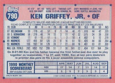
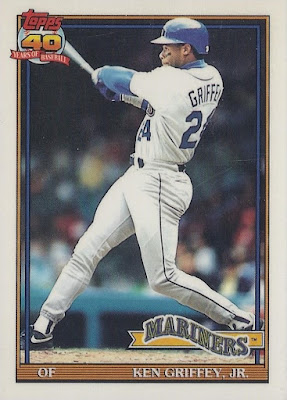
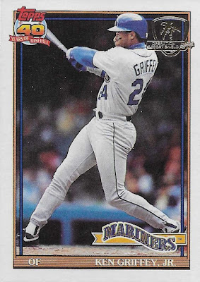
There are only two base Griffeys here, so we’re going to do this one a little differently so as not to go through all the different variations only to do it all over again immediately after. I give you both regular base Griffeys of 1991 Topps:
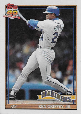 |
| 1991 Topps #790 |
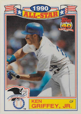
Way back in 1991 the world was not yet already familiar with Griffey’s trademark swing, so Topps rolls in all "Oh, have you not seen this yet?" and gave us a nice, unobstructed, head-on look at a possibly-still teenage Junior, his mighty swing taking center stage, filling the height and width of the card. This is a pretty run-of-the-mill card photo by the standards of just a few years later, but at the time such biomechanical precision and excellence was still a relative novelty. Like Hideo Nomo cards that showed that wacky sidearm stuff – amazing in 1995, but by 1999 they were old hat. In '95 people just weren’t used to it yet.
Wow, 22 home runs? This kid’s got it.
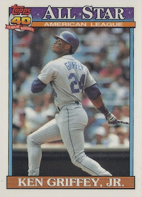
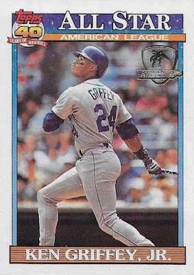
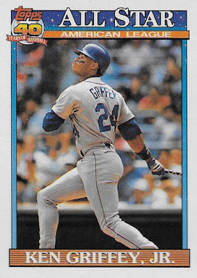 |
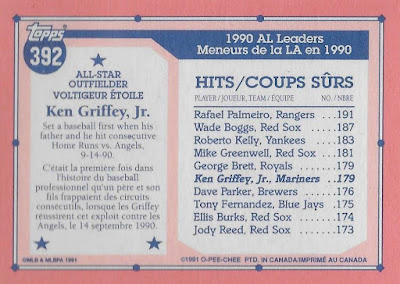
| 1991 Topps #392 All-Star |
This is actually one of my favorite All-Star subset designs, like, ever. It carries over some of the elements of the regular base card, but it also adds that lovely All-Star banner with the starry sky and attractive font. Just a great-looking card in general.
There’s not much to the back save for a quick look at where Junior stands in one of his standout categories, a section which differs by player. For example Rickey Henderson’s card shows his impressive stolen base count, and Jose Lind is praised for his “flippin’ sweet” sword collection. We all have our strengths.
Okay, most (but not all) of the rest of this post is going to be some variation on these two cards. Settle in.
 |
| 1991 Topps Dark Backs |
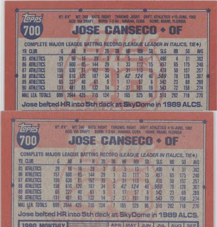
Let’s start with the printing variations. In all likelihood these are totally unintentional anomalies, but you know how collectors can be. Gotta catch ‘em all, and all that.
I've also seen these called "Bold Backs." For some reason the red bits, most notably on the 40th Anniversary logo, were printed just a little darker than on the majority of cards. BBCP estimated about a third of the total print run look like this. If this is true, there are probably millions of these things and they are dime box cards at best.
This probably comes down to when a given card was printed in relation to when the machines that were printing them were re-inked. I assume I have several, but I am not motivated enough to go dig them out because they are silly.
Okay, boring start, I know. This next one is at least a little but more fun:
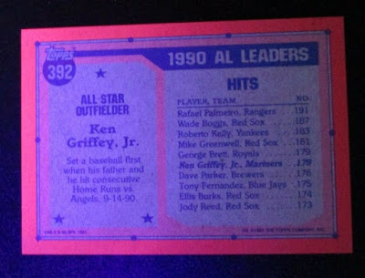 |
| 1991 Topps Glow Backs |
Somehow during the printing process Topps switched to a kind of ink that glows under a blacklight. I don’t own a blacklight (college was a long time ago), but I did find this photo online of what these look like.
By the way, under what circumstances were these discovered? I have my guesses, and they all involve jazz cabbage.
Once again, these are not rare - it’s just an anomaly. I have a few myself.
 |
| 1991 Topps #790 O-Pee-Chee Canadian Version |
These O-Pee-Chee or Canadian versions are not anomalies - they are a real variation, and they are pretty cool.
I have no idea the difference in print runs between the regular Topps and Canadian O-Pee-Chee versions, but you can bet there weren’t as many of the latter made as the former. If you want the milky white paper stock of these Canadian versions, expect to pay at least a little more.
 |
1991 Topps #392 All-Star O-Pee-Chee
Canadian Version |
By the way, both these and the Tiffany versions were printed on white paper stock, so it’s easy to confuse them if you are just shopping images. Apart from the Tiffany (aka “Collector’s Edition”) cards being extremely glossy, they also don’t have any French on them, nor does the word “Canada” appear anywhere on the back.
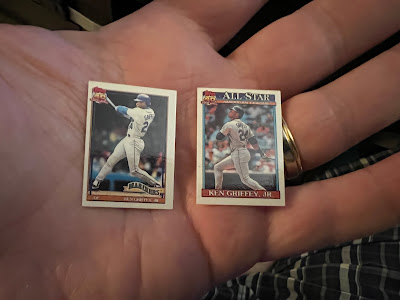 |
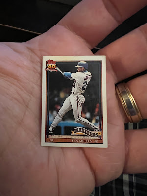
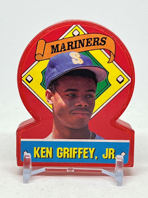
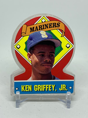
| 1991 Topps Micro #790 & #392 All-Star |
Topps Micro was sold as a complete set in an itty-bitty longbox containing all 792 cards in miniature. The coolest thing about these is that they are accurate in every practical way right down to the micro-printing of the utterly-illegible stat lines on the backs. This is the opposite of Cracker Jack cards which are slightly bigger than Topps Micro, but whose backs were nonetheless completely re-engineered for tininess.
Also you can give someone a pretty good beating with one of these longboxes. They’re just long and dense enough to get some good hits in before breaking apart.
 |
| The 1992 version for size reference |
 |
| 1991 Topps Cracker Jack #36 |
Do they still do this? I haven’t even seen CJ’s in stores in some time (I’m not really a fan), but next time I do I’m grabbing a box to see what kind of stuff is in there now.
These were released in two 36-card series with a pretty solid checklist. Had they mirrored the entire 792-card set, stars from this set would probably cost a pretty penny.
They did a fantastic job on the card backs, too. That is everything we’ve come to expect from the back of a card feng-shui’ed for optimal legibility in this tiny size. They even threw in Sailor Jack and his dog Bingo.
No Griffey All-Star cards in CJ boxes, though Bobby Bonilla got one. There are also plenty of stars and even a few decent rookie cups.
 |
| 1991 Topps Cracker Jack Uncut Panel |
I have no idea how these uncut panels made it out into the world, but it wasn’t in CJ boxes or Topps packs. BBCP mentions them popping up at trade shows, but that’s all I’ve seen on them.
As is the case with most sets from this era, uncut sheets exist for both series. Here is someone's uncut Series 1 sheet:
There's Junior's panel in the middle.
And then there are uncut sheets of uncut sheets with 12 complete series to a sheet which is how they were actually printed. This one is of Series 2:
 |
| 1991 Topps Cracker Jack Series 2 Uncut Sheet of Uncut Sheets |
I’m certain there are some for series 1 floating around out there as well. I wouldn’t include these on any checklists, but they are very fun to collect and display.
Okay, let’s go to the fun stuff:
 |
| 1991 Topps #790 Tiffany /4000 |
Tiffany cards, also known as “Collector’s Edition” have two distinguishing characteristics. They are printed on white paper stock (similar to the Canadian O-Pee-Chee cards), and they are extremely glossy on the front. The gloss is unmistakable, so if you are not sure if you have a tiffany then you probably don’t. You can’t miss this level of gloss.
Only 4000 factory sets were produced in Tiffany which is low even by Tiffany standards. The scarcest Tiffany cards I’m aware of are those from 1990 Bowman of which 3000 were produced, but I’ve seen production figures for some other Tiffany sets as high as 6000. That puts 1991 Topps on the scarcer end of the Tiffany spectrum.
Again, no French here.
 |
| 1991 Topps #392 All-Star Tiffany /4000 |
From what I remember seeing, and this may or may not still be the case as I bought these a very long time ago, the prices seem to be slightly lower for Junior’s Tiffany All-Star card than his base card simply for the fact that it’s a subset. This is very silly as 1) the All-Star card is the better-looking of the two and 2) there are the exact same quantity of each in the world. If anything I would be willing to pay more for the All-Star card because I like it better. Then again there is a propensity among card collectors in general to prefer base cards, but as they are equally scarce I don’t see the reason for the price difference. Maybe it’s because I’m a player collector and I need them both anyway.
I did do a little research, and from what I can tell prices on the 1991 Tiffany cards are not yet insane. They are really beautiful cards. Junkie recommended.
 |
| 1991 Topps #790 Desert Shield |
Man, oh, man, do I have a love/hate relationship with these things.
Let’s start with BBCP here because sometimes they say it all:
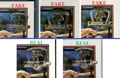
“1991 Topps Desert Shield is a 792-card parallel of the Topps set. Produced as a "thank you" to American troops serving in the Gulf War, this special run was supposed to be sent to the Middle East (in reality, a large amount of the print run never made it past an Air Force base in South Carolina). Cards were distributed in 15-card packs that look and feel like an ordinary 1991 Topps wax pack and each service member was entitled to one pack. All cards have a special "Desert Shield" gold-foil logo stamped in the upper-left corner.
Collectors should be advised that Desert Shield cards are very easy to counterfeit. Unopened Desert Shield wax packs are extremely rare and should only be purchased from a reliable source. Under close inspection, one can spot a fake by the orientation of the palm tree in the foil stamp. The bottom left tip of the tree should point between the E and R in OPERATION. If it doesn't, the stamp/card is most likely fake. In addition, the foil stamp should be crisp. The stamp is fuzzy on some fakes.
Approximately 6313 copies of each Desert Shield card were produced.”
Like I said: love/hate. Let’s start with love.
 |
| 1991 Topps #392 All-Star Desert Shield |
The Desert Shield cards in general are extremely desirable for a number of reasons apart from being scarce, patriotic, and fun. Here we have a whole set (and a relatively big set at that) of cards that mark an historical event and yet remain in the context of sports cards which is a difficult balance to strike.
The idea of packs being busted by a soldier in the field (despite the fact that this was not the case for most of them) and being reminded of the comforts of home gives them a certain emotional connection and authenticity. I read where most of them ended up, and I still can’t shake the image of these cards being toted around in a soldier’s pocket during a firefight. It’s downright romantic.
Being that it was a full-set parallel, every team and, therefore every city/state with a team is represented (which I’m sure the soldiers from each respective state probably appreciated) as well as more players than appear in the vast majority of other base sets. That gives them appeal for pretty much every single kind of card collector, be they PC, team collectors, or set-builders. God bless you if you are building this set, btw.
Then on top of that these cards also cross several collecting boundaries. There are plenty of people that would want these who own zero other baseball cards. Have you ever been in a bidding war with a military collector? Now that is a big money hobby.
On a personal level I was a kid during the Gulf War, but I distinctly remember the grainy night-vision shot from high-altitude aircraft on the nightly news, greyscale FLIR footage of white lines obliterating targets from silent gunships thousands of feet away, images of Patriot missiles knocking out bunkers and SCUD installations, and M1 Abrams tanks and Bradleys cruising across the sand with behelmeted solders brandishing M16’s along for the ride. I was ten. It was intense. We’re talking war, and war is personal for everybody on some level. Now put all those memories and emotions into a Griffey card. How much is that worth to you? Good or bad – emotion sells.
So, yeah. Obviously a lot of love for these cards. Now let’s talk about the hate.
 |
| I did not make this, nor am I qualified to even try. |
Case in point: there are a lot – A LOT – of fakes out there. It’s just a little bit of gold foil we’re talking about, but it’s enough to make a 25-cent card literally 1000 times more valuable. Even back in 2016 when I finally landed mine from another collector it cost me a little over $100 for the pair. Authentic ones are certainly worth a lot more now, but it’s not always easy to tell the fakes. You can read more here, but don't. Just don't.
As if that wasn’t a big enough problem on its own, BGS and PSA are both alleged to have authenticated fake Desert Shield cards. There are images of these things everywhere online. It’s hard to tell if anything is real on the Internet, but the slab numbers are verifiable. It’s the images I question. That said, there’s a ton of evidence this is going on.
Again, it’s nothing shady on the part of the authenticators (or I like to think that is the case). The fake stamps have just gotten that good.
And it is affecting the market for these things.
A couple things about that BBCP article. First it says the stamps appear on the upper-left corner of each card, but that is not the case. Second, and more importantly, I have never seen a Desert Shield card, real or fake, where the “bottom left tip of the tree” points “between the E and R in OPERATION.” Never once. They all seem to point to between the R and A, even some of the fakes. A few of the more obvious fakes point between the A and the T. I’ve also read that the bottom tip of the shield on fakes appears rounded or comes to a point where the authentic stamps are flat. This last one comes up a lot, but it is not always the case, again because the fakes are better now.
As for my cards I will say this: I’ve had them informally authenticated a few times by those who I perceive to be experts, and then again while I was putting this post together so as not to embarrass my self. I’ve only ever gotten a thumbs-up. I believe they are real, but I guess I’ll never know for sure. Some say the Mona Lisa currently hanging in the Louvre is a forgery, too. If a fake is good enough, what is the difference, really?
That said, please don’t ask me to authenticate yours because I am bad at it. I can only spot the really obvious fakes, but some are just too close for comfort. Do your research before buying.
Or maybe you want a nice alternative? Why not pick up a Tiffany? They’re all but impossible to fake, and at 4,000 produced vs 6,313 they are guaranteed more scarce than the Desert Storm stamps. There is a near-zero percent chance they were ever carried in battle, but apparently neither were most of the stamped cards, so there you go.
This whole post may as well have just been about the Desert Shield cards, huh?
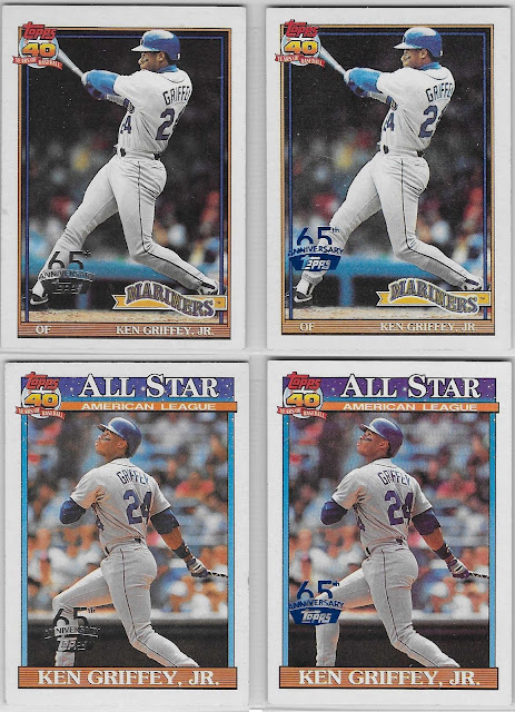 |
2016 Topps 65th Anniversary Buybacks #790 Blue (rare),
Silver (scarce), #392 Blue, Silver |
Okay, so these are probably more at home in a 2016 Topps post, but they are still authentic 1991 Topps cards. I suppose if you’re a ’91 Topps completionist you probably want them. Recognize.
I’ll spare us the 2015 Cardboard Icons jumbo reprints in black (#/199), gold (#/49), and red (#/10); but yes, they exist, too.
OK, enough with those same two cards. Here’s a reasonably nice, legitimate insert:
 |
| 1991 Topps Glossy All-Star #7 |
These fell one per rack pack, and they probably look familiar. The design is very similar to the Jumbo Pack Glossy Rookies from 1990. The back has very little actual information on it apart from the player name, but they look great and are printed in white paper with high-gloss fronts similar to the Tiffany cards. A very early bunt AND bat barrel shot of the Kid.
 |
| 1991 Topps Stand-Ups #17 |
I’d have to be pretty desperate for material to give these their own post. I’ve seen them referred to as “test issues” in multiple places which suggests they were test-marketed to some degree but didn’t make it to full-blown distribution. Topps did, however, make enough of them that they’re not terribly expensive.
Hey, there’s even a parallel.
 |
1991 Topps Stand-Ups #17 Clear Parallel
(test issue, plastic standing) |
Again, they must have made a ton of these things as neither is extraordinarily valuable. Then again words like “test issue” and “parallel” both applying to the same item is enough to make most eBay sellers salivate.
At least they don't take up too much space on a shelf.
That was a whole lot, and yet I still feel like I left something out.
This post was in draft mode for two years, and I finally got around to putting the finishing touches on it just before a major card publication outfit released their own popular 1991 Topps article. I held mine back partly out of laziness and partly not wanting to appear like I was jumping on the 1991 Topps bandwagon. If I'd been a little quicker I'd have seemed quite the topical blogger. Then again I'd probably have accused said major card publication outfit of stealing my writing-about-cardboard thunder. I'm not crankin' out three posts a year to play second fiddle to nobody...


