Wednesday, July 31, 2013

Design Timeline: Select

This post is part of an ongoing feature The Great Griffey Base Card Project.

If you wanted fancy cards, you got Upper Deck or one of the super-premiums, budget willing.  If you wanted cheap, there was always Collector's Choice.  Somewhere in between was Select.  The boxes of packs at the store never seemed to get any emptier, but there were a few years when I genuinely loved the base card design.

Select was intended to be a high-end version of Score to occupy that spot in the market just below Pinnacle.  They really hit their design stride in '95 and '96, then fell victim to a questionable design reboot in '97 and fell by the wayside thereafter just before the release of their sixth set during the cardmageddon of 1998.

Here is every Select base card design from their first in 1993 to their last in 1997:


1993:


That green is not an attempt to be team-appropriate - all the base cards are green.  That's right: Select's inaugural offering is one of those weird monochromatic sets.  Luckily that green is a little more baseball-y than the reds and yellows of other notorious early-90's sets.  The design is vaguely reminiscent of a baseball field, but there's not a whole lot to it.  The set as a whole is saved by the solid photography.


1994:


This is the first of three years when Select's designs came exclusively in a horizontal orientation.  This design decision resulted in some entirely new, unique layouts that didn't need a vertical counterpart.  The year featured two full-bleed action photos separated by a thick gold bar showing the player name.  The smaller picture has a team-appropriate color tint.  The set as a whole is different and interesting, and there are a few gems of photography in this set, too.


1995:


This is probably my favorite of all the Select designs.  Cool angular shadowbox with team logo in foil over sweet marbled color field and name below in futuristic font.  Everything else on the card is a solid action photo.  Bright and fun, simple and attractive, this set offered a high-end look for relatively cheap.  I was a big fan when these came out.

I got a box of '95 Select for my birthday one year.  I pulled two Artist Proof cards, and yippee!  Both were Midre Cummings' Showtime rookie subset card.  I finally get a whole box and a guaranteed parallel hit, and I pull two of the same card.  Needless to say I pulled hard for ol' Midre to have a ridonkulous season, but it didn't quite turn out that way.


1996:


I think this year's design was even better than the Pinnacle's high-end flagship set.  The dark wood grain with gold foil looks warm and rich.  You get another nice portrait and another year of solid action photos.  Cool inserts, the shiny Artist Proof parallel, and some great photography all combine to make this one of the great unsung and underrated sets of the 90's.


1997:


Select dropped the ball here.  They abandoned the ever-improving and unique horizontal layouts for a boring, run-of-the-mill vertical card.  This vanilla design is dominated by two-color foil with the name written vertically up one side.  The foil team logo and monochromatic mini-portrait are the highlights here, but as a package this layout falls flat.


1998:

Isn't this sad?


The '98 set never really happened due to the Pinnacle bankruptcy, but a tiny number specimens from that set did make it out into general circulation including a handful of inserts and a couple of Griffeys.  Hence, I couldn't bring myself to put nothing here because there really are a few (20 or less) Griffeys out there in the '98 Select base card design. 

I won't go into too much detail here, but I will reveal that having seen the design, I think it was a step in the right direction for the brand.  Those that made it out into the world are likely in the hands of supercollectors with far more resources than me; so if any of you super-hooked-up Griffey collectors read this, please e-mail me a scan of card #116 so I can show the nice people.  Your secret identity is safe with me.

_______________________________________________________________________________


Thus Select came and went like a fart in the wind, but it did hang around longer than some sets and even managed to produce some memorable cards.

I've said this before about other sets, but I'd like to have been at the design meeting in '97.  Such a drastic and terrible change in aesthetic still makes no sense to me.  Then again maybe this set was trying to carve out a niche in the market that just wasn't there. 

Here's every Select base card design in order by year:


Pimp My Cardboard: 1997 E-X 2000


In my collection: 4 regular, 1 Hall or Nothing

Griffey looks: bored

Is this a good Griffey card? Yes.  A completely blinged-out example of super-premium cards in the 90's.

The set: This set was a spinoff of Fleer's premium Emotion brand which would later become simply E-X.  It's got a layout similar to that of the Legion of Boom insert from the Emotion X-L brand of the previous year but with enough color and holofoil added to melt some faces.

2006 Emotion X-L Legion of Boom vs. 2007 E-X 2000 base card


When as a kid you would go to buy a pack of cards and find that there are only two of them in there, you would typically find yourself wanting - unless those cards were E-X 2000.  These babies have the look of a highly-desireable insert card, and there was no such thing as a bad pack rip because the 100-card checklist was packed with likeable dudes.

Sure you could argue that these cards are garish and overbearing (particularly compared with the Ginters and Gypsy Queens of today), but the one thing they are not is over-designed.  This is a deceptively simple layout with wonderfully eye-bursting complementary colors.  The translucent plastic, die-cut layering of the silhouette, and holfoil borders are arranged in harmony with none of them really dominating the card on its own.  Plus the bold font in gold foil gives the card a futuristic feel.

These were one of those cards you showed your Daddy just to hear him say "Holy crap, baseball cards have gotten cool."

Here's a couple I got from packs back in the day:


There were a few dominant color combos found throughout the set, each with a differently-colored sky.

Let's see that Griffey again:


1997 E-X 2000 #40: Griffey vs. Nega-Griffey

Junior looks a little bored here.  I'm used to seeing him display that pursed-lipped nonchalance, but today he's especially unconcerned.  I wonder if this was taken at a batting practice.

The silhouetted shot of Griffey at the top of his swing is mirrored on the back, so it looks like he's a righty.  Check out the airbrushed team name, reversed helmet logo, and the carefully-removed Mariners sleeve patch.  There are not many cards out there that feature an airbrushed Griffey, so this is a cool rarity.  Plus it's as close as you're going to get to seeing Griffey hit from the other side of the plate.

Here's one of the coolest inserts of all time:


1997 E-X 2000 Hall or Nothing #2


Super-intricate foil etching, foil printing on transparent plastic, and lots of die-cutting despite the extreme thickness of the card.  Check out the baseball scene etched into the front:


Amazing.  A blurry scan was enough to sell me on this card, but when I saw it in person I was blown away.  A really great insert.

Here are the cards from E-X 2000 I am missing:

#40 Credentials #/299
#40 Essential Credentials #/99
A Cut Above #2

That "A Cut Above" insert is a sexy beast.  Someday it will be mine.....

Let's talk about the set's name for a sec.  Everywhere I've ever seen it written it's called E-X 2000, but check out the back of the insert card shown above.  It says "EX-2000."  I like the latter better because typing that dash between capital letters is a hassle.  Also it should be called EX-1997, or am I being picky?

Monday, July 22, 2013

I'm on vacation!


Mariner Moose likes to cut loose.


Yours truly is taking a little time off.  For the next week I'll be camping on the shore of a lake with a bottle of Bushmills Irish whiskey and a smorgasbord of various IPAs and meals prepared by human hands.  I am extremely ready to get out there and start relaxing. 

While there I will probably not be posting anything (unless it rains a lot and I get very bored and jimmy-rig my phone to connect my laptop to the internet which I've never done but I know is possible), so I would like to take this opportunity to lay out what's to come on the blog here when I get back.

First, I've been concentrating on the Design Timelines a lot lately because they've been so fun to write.  There are still many, many more brands out there I have yet to tackle (Fleer, Flair, and Finest to alliteratively name a few), but I'll also be returning to my roots of covering individual brand years. It's been too long.

I just mailed out six yellow packages and five PWEs to bloggers I've been known to trade with.  There are still more of you I would like to send stuff to and a few that have messaged me or commented on posts requesting trades.  Yes, I want to mail you many cards, guys.  I'll hit you up when I get back.

I've got a couple of great posts that are already in the works.  I don't want to give anything away, but I'm sure they'll be a lot of fun.

Oh, and Junior is getting inducted into the Seattle Mariners Hall of Fame in a few weeks!  This feels like a practice run for the pomp and circumstance of his entry into the MLB HOF which is sure to follow.  I am hoping for at least a half-hour special on ESPN about my guy.  It'll look great on my DVR next to Top Gear and Puhoy, the Adventure Time episode that is an homage to the Star Trek: TNG episode The Inner Light.

The blog itself is really coming along, currently closing in on its first full year of existence.  At that time I will likely revisit my goals and give away a bunch of stuff. 

Until then folks, vaya con Dios.

Thursday, July 18, 2013

Design Timeline: Leaf

This post is part of an ongoing feature The Great Griffey Base Card Project.

Leaf was around before Griffey in the same way that O-Pee-Chee was around.  By that I mean for a kid in the American south, it wasn't.  Before that I understood them to be a regional brand.  I don't really count them as a set until they introduced their first mass-market product in 1990.  Touted as Donruss' premium set, people went nuts for it when it hit the market.  The photography wasn't out of this world, but it was solid enough.  They had a few hits design-wise in the 90's, but like many once-popular brands it stopped turning a profit and was shut down....twice.

When I collected in the mid-90's, Leaf were some of my favorite packs to rip.  They felt rich, like a poor man's Flair.  Sure, they were three bucks a pack which was a lot, but the inserts and subsets were great and the base cards were fancy.  At least they were in the 20th century - not so much in the 21st.  They still have a few of my favorite designs of the 90's and one in particular that's arguably my all-time favorite.

Here is every Leaf design in order from their first major set in 1990 to their final set of 2005:


1990:


This was a hugely popular set and remains so to this day.  It was completely different from every other set of it's time except Upper Deck who it was made to compete with.  The design is simple and clean and the backs feature full-color portraits and nice, big stat boxes.  I think people were ready for a design like this with muted colors that don't distract you from the picture.  Plus you've got to love that cursive "L," right bro?  Definitely the most fun upper-case letter to write in cursive! <high five>

1991:


The second of the three "silver sets," this one includes an intricate border with black corner finials like a photograph in a scrapbook.  The name is below in a white field with the position.  They left the team logos out of this design to avoid the card looking too cluttered.  Very fancy.

1992:


The white name in the black field looks great, and look!  A color design element for the first time in Leaf's mass-market history.  They underlined the name plate in red and include a team logo.  While this is the most cut-and-dry of the three silver sets, it's also my favorite.  Bold and striking, this is also the last Leaf set that would feature horizontally-oriented cards.

Over the next four years, team-coloring in and around the name plate replaces the rampant silver of the previous three sets.  Check it out:

1993:


Finally a full-bleed layout.  This set is characterized by that slanted name plate above the field of marbelized team color.  The gold lettering and brand-new logo proclaiming this card is from "The Leaf Set" (oohs and aahs) give this card a high-end look.  I'm a big fan of the blue ribbon beneath the seal showing the date, an element that is both useful and attractive.  Plus I feel like I won something.

1994:


The marble theme continued in this "wave" design with the new Leaf logo on one side.  The player name is in a prominent elongated font with the team written below nice and big.  The wave colors vary by the player's team, and they all match without coming across as gaudy.  Attractive design with a great use of color here has made this set a collector favorite.

1995:


There's a lot going on in this card, but I find everything comes together organically and attractively.  Every card in the set is vertically-oriented and most of the pictures are of players running, pitching, batting, and fielding - you know, stand-up stuff.  The photos keep the player towards the right side of every card to accomodate the team name and portait elements printed in translucent holofoil on the left.  Below is a team-colored bar with the player name in extremely fancy gold-foil script.  The new logo featuring the set year is also stamped in gold below the holofoil portrait.  If you flip through this set, you'll find that they picked the perfect pictures of every player to keep the design from appearing cluttered. 

Then again, I'm pretty biased.  I have an emotional bond with this set, and I'm currently only eight cards away from completing it.  That's a big deal for me as I'm not a set-builder.


1996:


Translucent foil bars tinted a team color fill the left and bottom borders with the Leaf logo in the corner.  The player name appears below in a fancy stretched font, and his poition is shown in a small circle up top.  It was quite a step back from the heavy-handedness of the previous set, but it's not unattractive and the photography was particularly good this year.


1997:


First I must admit that this is another great font and a really cool, modern design, all centered and looking great.  Frankly, everything in the middle of the card is right up my alley.

BUT...

That fade on either side, man.  I think the reason behind it is to create focus on the action in the middle, and in the first series of this set those fades were a nice silvery-gray color (like me saw in those first three Leaf sets).  It looked pretty good.  So what happened?  I'm not sure if someone made a conscious decision to do this or if they flipped a switch and screwed up the whole printing process of Series 2, turning the gray fade to a white one, but yikes.  What before was a subtle, attractive effect now looks like a washed-out eyesore.  I'm willing to bet that someone really liked the glow effect the white creates behind the name that wasn't there before, but that person needs to be hit in the head with a hammer.  Their worst design of the '90's - this card gives me a headache.

1998:


This card is easy to pass right over, but it's a really cool design if you really look.  First it's got this great organic border similar to that found on the 2001 Donruss 2000 "Throwback" insert design.  It's translucent so it frames the photo without obstructing it.  The small corner finials and 3D shading effect set it off nicely.  I also love the banner anniversary logo with the little spikes of modernity plus the inclusion of the team name up top, and what a great picture for this card.  A little more color may have boosted this set's appeal, but it really is a solid design.

This is the part when Donruss declares bankruptcy and is bought by Playoff, a football card company.  Four years later Leaf would return with a snazzy new logo and a terrible new design.

2002:


You tell me what aspects of the Leaf aesthetic are apparent in this design.  I mean it - show me one.  This card looks less like a Leaf card than an actual leaf.  Look at the big, stupid team name.  It's infuriating, but I do like the logo and the fact that it shows the set year.


2003:


The least horrible of the 21st Century Leaf designs, this set still isn't very good.  It does have a few positive attributes such as the red and black squares and lines remind me of a Piet Mondrian painting.  I like the slight fade on the right side of the photo, and I also appreciate that the team name isn't chewing the edges of the card.  Not horrible, but also not very Leaf.

2004:


Zzzzzzzzzzz...........

And what happened to including the set year in the logo?  These guys must have hated everything I like.

2005:


A classic lines-and-boxes-for-the-sake-of-lines-and-boxes design.  I've seen worse, but this might as well be an oddball promo card made for Pizza Hut.  By far the least Leafy of all the Leaf designs.

And that is where Leaf finally fell off the tree and got sucked up by the lawnmower.

_________________________________________________________________________________


I really loved Leaf in my collecting heyday as you can probably tell from my enthusiasm about the earlier sets.  It remains one of the few brands I was genuinely excited about cracking packs of year after year, but after seeing what was done with the brand I'm glad I was no longer collecting when these last few sets went down.

Should we be glad the brand was allowed to come back for a few years, or would it have been better to let it go back in '98?  Stephen King taught us in his novel Pet Sematary that it's best to let the dead be dead; otherwise they become evil undead monsters who slice into your Achilles' tendon with a scapel.  Then again, in the film National Lampoon's Chritmas Vacation Uncle Louis burns the Griswold family Christmas tree with his stogie and says "At least it's out of its misery."  Between these two I'm siding with Uncle Louis.  He had a sweet rug.

Here is the complete Leaf design timeline from 1990 to their final set in 2005:


Organization Overhaul: How to Keep Track of 5000 Griffeys


The organizational skill you need to pursue this hobby and not go insane is considerable.  When I have cardboard time to spare I spend about 85% of it organizing, 5% scanning, and 10% writing posts.  I’ve recently been undergoing a major organizational overhaul; hence I’ve been lax in my blogging and trading duties.  For that I am sorry.

But I’m really proud of the progress I’ve made in the organizational arena and how much better my collection as a whole looks in general, so I’ve decided to share my ideas on the subject.  For those of you who are interested in such things, I give you:

The Junior Junkie Card Organization Manifesto

"Peace resides in the simple." - Ancient Chinese proverb

"Wax on, wax off." - Mr. Miyagi

"If you become a hoarder, I'm divorcing you." - My wife

These are the principles that guided me in my creation of a more efficient system for amassing choice cardboard.

When this process began my collection was a virtual sharknado of piles and binders, boxes and unlabeled dividers.  You might think that just being a Griffey collector with a handful of PCs is stress-free and easy.  My early-onset male pattern baldness says otherwise.

Generally speaking, my collection can be divided into two parts: Griffeys and Other.  Each part has its own rules to obey and trends to follow - otherwise there would be chaos.

Let’s talk about the Griffeys first.

Binders work well for Griffeys as that part of my collection is not in flux - it only grows.  I can simply add new pages to binders as needed when I get new cards.  When I originally got it in my head to organize my Griffeys I bought three 100-count boxes of 9-pocket Ultra Pro Platinum pages and five 4” binders.  My plan was to group them by date and put them into binders by year and quantity owned.  This worked great until I started blogging and my collection tripled in size.  Suddenly I had stacks and stacks of unfiled Griffeys, and specific cards were a lot harder to locate.  I was overwhelmed.  A new system was needed.

First I emptied the existing Griffey binders, combined them with all the unsorted stacks I've acquired and split them up by year.  To hold them in the interrim I bought one of those giant, five-row card storage boxes and put all the Griffeys into it.

I took a ton of pictures because I was excited to have all my Griffeys in one place:


When I took those pictures I had forgotten about an entire long box completely full of even more unsorted Griffeys, so in that picture was only about 85% of my totaly Griffey hoard.  This box is supposed to hold 5000 cards.  Accounting for especially thick cards and penny sleeves, these pictures probably have closer to 4000 Griffeys in them.

In that box they stayed as I contemplated what to do next.

After a lot of thought, some money spent, and a weekend in front of the TV sorting and labeling, the new system is finally complete.  I kept the collection divided up by year, but also divided them up by brand and sub-brand to more easily facilitate both posts about individual sets and design timelines.  This way required that I have a lot of binder pages because there are going to be some empty pockets and the occasional half-filled page; so I bit the bullet and invested in four more boxes of Ultra Pro Platinum pages and dedicated two more binders to the cause.  


I have finally completed this mammoth, weekend-long task:


Having just finished

Labeled and on the shelf


That’s 6300 pockets filled at over 80% capacity.  Thus we have surpassed the 5000-card mark.  Here's hoping this costly new system works out.

UPDATE: I am writing this having subscribed to the new Griffey binder system for almost two weeks now, and I couldn't be happier.  I have learned that at my collection's current rate of growth, I'll most likely have to add another binder some time this year.  I'll write "Jr." on that one.  For now though, all is well on the Griffey front.

The organization of the Others has proven to be more of a challenge.  

First of all, the idea of having every card I own in binders is out the window - it’s costly and far too impractical as that part of my collection is in constant flux.  I’m always acquiring old cards of dudes I like and new cards of new dudes who are just starting out and even non-baseball dudes.  I’m also constantly trading away cards to other bloggers or having to flip through heavy binders looking for a specific player which is a hassle with so many cards to deal with.  To sum it up, maintaining binders is out of the question.

I decided to ditch the binders and use the interrim Griffey storage box as my new permanent “Other” storage solution.  The bulk of this box will be all my keepers arranged alphabetically by player name.  I've attached filing tabs to top loaders to divide up letters, and wider tabs on smaller top loaders to mark players for whom I have a large quantity.  I’m toying with the idea of putting them all into penny sleeves.  We’ll see.

Here's how it turned out:


The Other Box


The great thing about the box system is that I can also put small card sets in there, themed and player collections can have their own slots, and the system can be changed around with ease.  The idea was to have my entire “Other” collection in there and in order in a single day.

When all is said and done, all that should remain in my collection will be the Griffey binders and the box of others.  Of course I’ll also have a few complete sets as well as some oversize Griffey items, but the loosely-sorted stacks on shelves and numerous long boxes containing God-knows-what will be a thing of the past.  Fingers crossed...

UPDATE: This part has proven to be a bigger job than I previously thought.  The Other box has filled up quickly, and I have deduced that it will not be my only storage solution when all is said and done.  My final goal remains a storage system that is simple, and I'm confident I'll get there.  There's just no way one box will get me there.  I'll have to make use of additional boxes to store small sets and large player collections.

I've also started pulling cards from the box that are too good to not be in a binder.  I'm thinking these will end up in a binder of their own just as soon as I can think of a cute name for said binder.  

I snapped a few pictures of the physical state of my collection for your perusal.


The Griffey Binders
  
The Other Box where the non-Griffeys I want to keep go.


The Shelf, where I keep PC's, sets in progress, some oversized and display items and boxes I need to access frequently.


The Closet, where I keep complete sets and boxes I don't need to access a lot.

The box of small sets

The scourge of my collection: thousands of cards I don't want sorted by team


Not shown:

- a printer paper carton completely filled to the point of being unliftable with even more unsorted cardboard I don't want, at least enough for two more of those boxes shown above
- two additional binders of non-baseball cards and uncollectables
- another plastic box full of trades set aside for specific bloggers

The perfect way to end this post is with a plea for somebody to take some of these cards off my hands.  You can see that I don't keep very much of what I get in terms of mystery boxes and repacks and such, so you know there's some good stuff in there.  If you have any interest in a box filled to the brim with cards exclusively from your favorite team and you have something to trade, message me.  I'm in.

Wednesday, July 17, 2013

Design Timeline: Stadium Club

This post is part of an ongoing feature The Great Griffey Base Card Project.

Welcome to what may be the greatest of all the Design Timelines.

The secret to a great set is a great base card design and solid photography; and year over year, Stadium Club remained among the best-designed sets on the market.  There's not a single bad design in the bunch, and most of them are downright excellent.  They were always cutting-edge and fun as is evidenced by their cool inserts and parallels.  And the photography?  Fuhgeddaboudit.

I'm a huge proponent of this brand because I think the fusion of simple design and great photography has resulted in some of the best sets of the last 20 years.  You don't have to go nuts, adding and adding colors and lines and effects to make a great card.  Stadium Club as a brand proves that because none of their designs are particularly overbearing - quite the opposite: they tend to complement the photography without getting in the way. 

Here is every Stadium Club base card design in order:


1991:


This was Topps' first "premium" set, and they pretty much nailed it.  Full-bleed from their very first set, '91 Stadium Club had a lot of first-time features.  The vivid, full-color backs featured images of each player's Topps rookie card as well as new stat configurations.  The photography was fantastic as was the checklist.  And did I mention it was the first mass-market brand to put foil on every card?  When it burst onto the scene, huge premiums were being charged for packs.  This thing was just a total beast.


1992:


Topps knew they had some of the best photography in the game with this brand, and they flaunted it by putting a Kodak logo on boxes and packs and by designing with low-impact name plates so as not to interfere with the photograph.  This is the most extreme example of that low-impact design.  They might have gone a little too dry with this one: just a logo over a black bar and the player name.  I can't tell if they were being trailblazers or just lazy, but the photography in this set is good enough that it doesn't really matter.

1993:


This sporty design is the first of my three favorite sequential Stadium Club designs.  Not a lot to it - just a red bar accented in gold and a little baseball with motion lines.  The exciting font is pressed right into the card in gold with black shading, and the SC logo hovers over the name plate majestically.  It's a simple design, but also a bold one that looks great with any team and in any orientation. 


1994:


The label maker set.  This design seemed cool and gritty at first, then after a few years passed it started to seem hokey as the label maker was phased out of everyday life (my grandpa had one), but now I find it nostalgic and fun.  It's hard to naysay when a set has such great photos.  They focused on red again, and it turned out pretty awesome.  That new SC logo only lasted this one year.
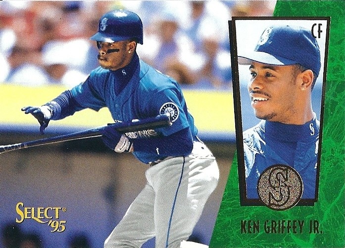

1995:


Another great-looking design, I remember these being slightly thicker than normal (am I imagining that?).  A nice, balanced design with yet another new SC logo design, this one revolves around that shape at the bottom containing the team logo.  The player name appears below in yet another bold, modern font.  Classy.  Another personal favorite.


1996:


This design appears modern to the point of futuristic.  It's a simple curved color bar with the name stamped in foil and a single textured accent line.  In the future everything will have little spikes, so that's appropriate.  The baseball in the SC logo is also a nice touch.


1997:


Check out the great Willy Wonka name plate.  This year's design is fancy and whimsical with stars and matte gold filigree and that great spiral.  The color bar is raised with the player name imprinted in gold.  These came in red or blue, and they looked great either way.  The Matrix limited parallel is damn beautiful - it bothers me that I'll someday have to put it in my '97 Stadium Club set post, and I already know the scan won't do it justice. 

Anyhoo, this is the first and last year the base card would not feature the latest Stadium Club logo.  They simply printed the brand below the name plate.  I'm not sure how I feel about that.  It's not as ugly as when someone's house address is spelled out in letters (old people are guilty of this a lot).  Normally I would prefer a logo, but the round TSC logo would look out of place on this card.  I guess they got it right.


1998:


This is the first year of the "brick" logo that would last to the end of the brand and even it's attempted reintroduction.  Now, while I'm appreciative that Stadium Club never try and shove anything down our throats design-wise, a little embellishment can be fun.  Here they give us another year of stellar photography as well as a new logo in awesome holofoil and a shiny player name.  You can see the baseball stitch design on opposing corners, the bottom one containing some silver foil.  It's a reasonably cool card, right?

And yet, I can't help believing that they intended these cards to be enjoyed on a more tactile level.  The first thing you notice about this set is that the cards are a little thicker than normal and incredibly glossy - I mean like a seal that just hopped onto an ice floe and the water is still streaming down it's skin and it's all shiny and glisteny?  That glossy.  It looks like they applied several layers of glossiness to achieve this level of uber-gloss.  Moreover, the "stitched" corners are embossed, giving the feeling that the card was wrapped around a baseball to achieve the effect.  The result is a rich-feeling card that's a delight to handle.

Go find a '98 Stadium Club card and hold it in your hands.  It's the cardboard equivalent of petting a really soft bunny.


1999:


This one reminds me of another one of my favorite sets of all time: '95 Upper Deck.  It's a little more stylized with the cool baseball effect and the holofoil, but its still very similar.  The team logo is also shown in the top left corner in the lowest-impact fashion I've ever seen on a card.  The font is a bit plain, but overall this design embodies the spirit of non-interference combined with great photography that makes SC so likeable.


2000:


This year they went with a waving pennant in team colors sporting holofoil printing and team logo.  The font has been updated, too.  Simple, classy, fun, one of my favorites in the timeline.  Great base card.

2001:


Only Ultra has more shots of Griffey fielding - it makes for some great pictures.  This is the only time they would ever take up the entire bottom border of a card, and I think they did it well.  Everything's centered, I love the date on the front, the name bar looks sweet in holofoil, and I'm a big fan of incorporating baseballs into the design.  Not as minimalist as some other years, but a fun design.

2002:


Again, could be more minimalist.  Every brand has that one set (some have more) wherein they go for that "modern" lines-and-shapes-for-the-sake-of-lines-and-shapes design.  This is Stadium Club's.  While not as indulgent as some other brands (Upper Deck went nuts with it in a lot of designs), this design still takes you out of the timeline.  It could have been a lot worse, and it's actually one of the better designs I've seen in that vein.

2003:


This feels more like a Stadium Club card.  Another one of their more muted designs, '03 sports a small, simple name plate and a logo set apart with semi-circles.  While the monochromatic, all-holofoil look is something to behold, a little more embellishment would have been appropriate, too.

And that was the last set in SC's continuous history.  They would disappear from shelves for a full five years before....

2008:


I love this design because it reminds me so much of the '93 design, and I love the '93 design.  It looks great with the team-appropriate color bars as opposed to 1993's all-red, but it's practically the same font.  Call me old-fashioned, but I'd like to have seen the little baseball make a comback here.  Fans of the original set would have gone nuts.

So what happened?  I wasn't collecting around the time this set came out, but if I had been I would have been very excited at the set's return.  Unfortunately it didn't do terribly well due to its having been remade into a completely different product by Topps.  I'll explore it more when I do an '08 Stadium Club post, but suffice it to say they screwed up what should have been an easy sell and now Stadium Club has gone the way of numerous crappier brands.  Prizm, however, remains widely available.

This brand deserved better.

______________________________________________________________________________


Bringing back Stadium Club seems like a no-brainer to me.  Topps owns it, right?  They have the MLB license, and they use it to make a half-dozen or so other brands that I don't buy.  Meanwhile this great brand with an awesome history is just sitting in the barn.  What is the holdup? 

If you're looking for someone to spearhead the project, Topps, I'd like to throw my hat into the ring.  Who better than a seasoned collector with good taste and an appreciation for the brand's core aesthetic to help resurrect a classic set?  I am not kidding.  Let's make money together.

While I wait for Topps to blow up my e-mail, here's the complete timeline of Stadium Club card designs: