
It follows that when there are two competitors in a market there will be a certain amount of…well, I don’t want to say copying. Let’s say timely mirroring of each other’s products. One company makes a high-end throwback set with painted images and nice borders, the other does the same thing soon after.
When Topps came out with their high-end throwback Turkey Red in 2005, Upper Deck followed suit in 2007 with UD Masterpieces. While Topps’ design is based on a real set of cards from the turn of the century (Um, the one before last. Haven’t had to qualify that much. Feels weird.), Upper Deck’s is a completely original design that is both classic and modern. I get and respect what Topps did with Turkey Red, but personally I’m a Masterpieces guy all the way.
There’s not a lot to complain about with UD Masterpieces. Maybe the fact that it has a small checklist – only 90 cards. Maybe the fact that some of the paintings aren’t as photo-realistic as you would like to see. Maybe the massive spectrum of colored border parallels and one-of-ones. Whatever issue you have with this set is simply not enough to keep you from loving it.
Let’s do this quick because if you are reading a baseball card blog right now, odds are you’ve held and probably owned Masterpieces cards before, so you already know about this set’s high-end paper stock with canvas texture, perfectly-executed foil embellishments and nameplate, incredible imagery, iconic checklist of current and retired legends, and beautiful card backs. I don’t need to remind you of any of this.
Okay, Griffeytime:
 |
| 2007 Upper Deck Masterpieces #29 |
Just a really cool image of the Kid having just launched one deep into right field. There’s a great sense of balance and power in the way Junior is carrying himself here, like he just did something effortless and he is already stepping towards first on a leisurely trot around the bases. This is a warrior pose if there ever was one on a baseball card. Oh, and look sharp, Adam Dunn fans – your boy has a sweet background cameo on this one.

The blurb is okay, but it seems to harken back to a brighter day. It’s not negative in any way, but as a bitterly defensive Griffey guy, I’m getting a real “What have you done for me lately?” vibe from this one.
Upper Deck more than made up for that dubious blurb by giving Junior not one but TWO cards in the base set:
 |
| 2007 Upper Deck Masterpieces #45 |
Hey, a Mariners card in 2007? Cards had come out before that still showed Junior in a Seattle jersey but listed his team as the Reds (mostly in 2000), but this is the first that appears to be a true Mariners card long before he signed back with them in 2009. Cards like that are a dime a dozen now that he’s retired and the M’s his obvious heritage team, but back in 2007 when he was active and with the Reds it was pretty uncommon.
Check out Junior’s feet here - he looks poised for a long throw just as soon as that ball hits his glove. It’s also nice to see him actually use those expensive sunglasses for once. I enjoy the ball hanging right above the brand name here as well as the way the outfield wall frames the photo. A thoughtfully-assembled card. The only issue I can spot is that the fielding shot on this card front matches the back of the other base card a lot better as it talks about Junior’s gold gloves and is even titled “Griffey sensational in center.” Maybe the epically under-used pile-up shot from the 1995 ALCS win would have worked better here.

This blurb is a huge improvement, recounting a specific memory (albeit from 12 years ago) instead of facts that show what a great player Junior “used to be.” Outta here with that, UD.
I have exactly four of the numerous parallels that these cards come in. I usually include this list at the end of a post, but for this set I’m going to show it now because it’s pretty crazy. Here are all the Griffeys I still need from 2007 UD Masterpieces:
#29 Black Linen #/99
#29 Deep Blue Linen #/75
#29 Pinot Red #/75
#29 Blue Steel #/50
#29 Hades #/50
#29 Ionised #/50
#29 Rusted #/50
#29 Artist’s Proof 1/1
#29 Bronze Ore 1/1
#29 Celestial Blue 1/1
#29 Persian Blue Linen 1/1
#29 Red Linen 1/1
#29 Urban Gray 1/1
#29 Printing Plate 1/1 (set of four)
#45 Green Linen
#45 Black Linen #/99
#45 Serious Black #/99
#45 Deep Blue Linen #/75
#45 Pinot Red #/75
#45 Blue Steel #/50
#45 Hades #/50
#45 Ionised #/50
#45 Rusted #/50
#45 Artist’s Proof 1/1
#45 Bronze Ore 1/1
#45 Celestial Blue 1/1
#45 Persian Blue Linen 1/1
#45 Red Linen 1/1
#45 Urban Gray 1/1
#45 Printing Plate 1/1 (set of four)
Box Topper 5x7 Painting
Box Topper 5x7 Painting Signed #MP-2
Box Topper 5x7 Painting Signed #MP-18
Captured on Canvas #CC-KG
Captured on Canvas #CC-KG Bronze 1/1
Captured on Canvas #CC-KG Forest Green 1/1
Stroke of Genius Signatures #SG-KG
Stroke of Genius Signatures #SG-KG Windsor Green
Stroke of Genius Signatures #SG-KG Printing Plate 1/1 (set of four)
Yikes. For those who weren’t counting, that would be twenty-six 1/1’s. Even leaving those out, this is a very difficult rainbow to complete for any player, but I’m certain they look amazing all paged up together. So I put out a call to my fellow Griffey freaks, and wouldn't you know it? Somebody has put some $erious effort into this set. Brace yourself as you behold the 2007 UD Masterpieces collection of the great Rick Seifert:


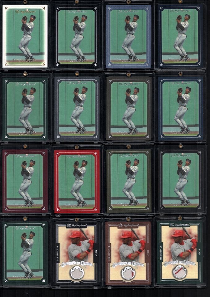


Bananas, man. The Griffey game is not for the faint of heart. You gotta want it. Also it helps to be actively collecting when a set like this comes out. You're a legend, Rick.
Now even Rick will tell you that the different parallels of this set are notoriously difficult to tell apart. More on this in a moment. Here are the comparably unimpressive parallels I have:
 |
| 2007 Upper Deck Masterpieces #29 Green Linen |
This card actually looks great framed in dark green. Okay, I’m sold.
 |
| 2017 Upper Deck Masterpieces #29 Windsor Green |
Wait just a minute…
 |
| Windsor Green (L, I think) and Green Linen (R, maybe?) |
So I bought these on COMC a few years ago, and I remember when they came in I thought there must be some kind of mistake. The cards are identical. I’ve compared the frames with each other at close range, and under magnification. I’ve set them face down and side-by-side looking for some indicator on the backs that reflect a difference, but nothing.
Eventually I was told the difference is that one border has a slight canvas texturing to it. I mean, kinda? Weird choice, UD.
BTW, the backs are all identical to the base card save for the numbered parallels of which I have only one:
 |
| 2007 Upper Deck Masterpieces #29 Serious Black #/99 |

Sneaky Harry Potter reference, Upper Deck. Pretty clever for a bunch of muggles.
You can kind of see the blackness of the border in the scan, but it pops mightily in person. These parallel border colors get pretty pricey, too, even the unnumbered ones. I think a lot of folks try to rainbow this set, and I don't blame them. Thing's a banger.
 |
| 2007 Upper Deck Masterpieces #45 Windsor Green |
Or is it Green Linen?
The fact that Griffey collectors going for the rainbow also had to chase TWO of each border color is kind of cruel, but I'm 100% certain a binder page loaded with multicolored borders is damn satisfying.
If there was ever a set of cards that was a tribute to baseball cards in general, it would be this one. Like if they wanted a set of cards to include in the Voyager spacecraft along with Carl Sagan’s engraved steel naked people plate and gold-plated record of the sounds of Earth - something to be sent out beyond the Solar System that will appropriately introduce our species to whatever intelligent life may find it. Yeah, Masterpieces, of course.
And as if all that wasn’t enough, Upper Deck did it all over again in 2008 with a second year of Masterpieces that’s just as good as the first and with the addition of gold foil fleur-de-lis in the border design. I’ll put that post together when I think of a few new superlatives about how wonderful it is.
Those are incredible!!! One of my favorite sets ever.
ReplyDeleteLooking for the best place to buy Psychedelics Products Online ?
ReplyDeleteVisit the website below and thank me latter
buy MDMA without prescription
buy magic mushrooms for depression
buy magic mushrooms for anxiety online