In 1996, three years after Chromium printing made its much-lauded debut in the Finest set, Topps started decking out their flagship set in the stuff and marketing it as a high-end alternative (or extension) of the flagship set. The result was a flashier-looking base set with the addition of refractor parallels, much shorter checklists, and only four cards per pack. Very fancy.
I’ve said it before (recently, even) – I just can’t bring myself to make fun of Topps Chrome, and I’ve only just figured out why: these are the new Tiffany cards. Remember when you first saw an original 80’s Tiffany card in person? High gloss-front, clean white cardboard backs, colors that pop and gleam in the light, scarcity, exclusivity, low print runs, the WOW factor? Topps Chrome is Tiffany: the Next Generation. The checklist is bigger and there are far, far more parallels nowadays; but there remains a sense of richness, of weight, a feeling that these cards are a little more substantial than their non-chrome counterparts.
Be all that as it may, I still treat Topps Chrome as a parallel rather than an independent set when it comes to binder placement. Also, a few of the design descriptions will be a lot shorter than in other Design Timelines as all of these designs have already been covered in the one I did for Topps Flagship. I suppose I will try to add a little something new to each one in the interest of, well, interest.
Without further ado, here is every Topps Chrome base design featuring a Griffey in order by year:
1996:

This is the first year, and already precedents are being set. First, everything that was white in the original card is now silver chrome. All other colors are now mirrored versions of themselves. You’ll notice that there is the occasional 3-D mock raised-printing effect added to the design that only Chromium could facilitate. In this release it was a thin, dimpled border around the picture and a field of diamond shapes in the background. The Star Focus subset from this year features a field of stars in the background - a great look that makes that card one of my favorite Griffeys of the 90’s. Sadly this is the only set in which we would see such prolific use of that effect as going forward Topps appears to have gone for a more direct representation of the original card. What little mock-raised-printing we do see in the remaining timeline occurs incidentally in areas of color separation.
1997:
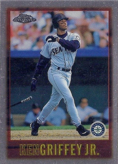
The silver helps eliminate the stark boringness of the original white border, so the Chrome version is somewhat more exciting. It doesn’t save the design, but it’s a lot less boring overall. Isn’t that the point of the chrome, after all?
1998:

The original base card design had that border in a brown color that I guess they were trying to pass for gold. This looks a million times better. I nominate this guy for design most improved by the addition of chrome. The original border color probably would have benefitted from a metallic chrome treatment, but Topps’ decision to stick with a true chrome border shows us what could have been in the original base design.
1999:

Again, gold becomes chrome here, and again the effect is a better-looking card. This year Topps would begin shading the background around each player. Frankly I think they could have pulled this off without that change; but with such low-impact design elements on the original base card this year, I get why they felt they had to do something to direct the focal point of the card. Plus it gives Junior a nice glow like one of those Brian Dennehy aliens in Cocoon.
2000:

There’s something about the weird border color used on the original base card that I begrudgingly liked. That being said, I don’t find this chrome version any better than the original. The backdrop shading really hurts the photography here. Ho-hum.
2001:

This year we get a hint of changes to come – for the first time Topps Chrome is about chromium, not just chrome. This change will become more apparent in future sets that feature chrome lettering on fields of white in the original design.
The original 2001 base card is characterized by the unique teal border, and rather than replace it with a chrome one as has been done every year up to this point, for the first time Topps keeps true to the colors of the original. The result is one sweet-lookin’ baseball card. Somebody made the right call.
2002:

Back to true chrome for the border this year, but UGH, so much better than that orange-brown of the original. I feel like this design could have lent itself well to the numerous border color parallels of today, but there is no doubt that the chrome on its own is a huge improvement.
2003:

The bright colors of the original base card look great in chrome, making this another big personal favorite of the timeline. This design would have suffered a lot had they replaced the blue here with silver chrome. I want to lick this card like a Ring Pop.
2004:

This is a big year for the idea of chromium, not just chrome. As you can see, the brand facilitated Topps’ return to perennial white borders with chrome lettering by not replacing the white with silver chrome, opting instead for a chromium version of white. With no fundamental change now between the regular and Chrome cards except for the stock, this is the year Topps Chrome truly becomes the new Tiffany.
I’m ambivalent about this change because while we lost the fun, fantasy element of seeing these designs in shiny mirror silver, the original designs are better-represented and there is more consistency among sets and in the transitions from regular card to chrome card. That being said, this is also the year Topps flipped the boring switch. Prepare ye for scantily-worded design reviews.
2005:

I mean, yeah. It’s the same thing on fancy stock. Chrome lettering, just like the base card.
2006:

Again, no significant changes here apart from the background shading that we should all be pretty used to at this point.
2007:

That black looks great in Chromium, am I right? The refractors are especially cool this year.
2008:

The photography looks particularly dark on this design. Part of me believes they intentionally darkened the base cards of Topps Chrome to increase the appeal of the refractors. All the refractors do look bloody awesome, by the way.
2009:

Starting to miss the chromed-out borders?
2010:

And the rest…
Thus ends the timeline for our purposes. Topps Chrome continues to be made to this day, and in 2012 they returned to chroming out plain white borders to keep the monotony at bay. The brand logo remains unchanged since the brand’s inception – isn’t that nice?
_________________________________________________________________________
Topps Chrome went a little stagnant for a few years, but it’s nice having a higher-end version of the flagship set. Plus the colored refractor variations give us a cool and interesting take on the original design not possible on regular cardboard. Chrome reprints have been produced of numerous Topps card from the past (Griffey’s ’89 rookie included), but those are one-offs that occur outside of this timeline.
That’s it for this Design Timeline. As always, here is the complete Topps Chrome Griffey Design Timeline:


2007 might be one of my all-time least favorite Topps designs, but I loved the refractors in that year's Chrome. Especially the white ones.
ReplyDeleteI liked the white refractors too.
ReplyDeleteHey Junior Junkie, you posted on my site about Sandy Alomar Jr. cards you might have for me. I can't find an email address to contact you. Could you email me? Thanks.