This post is part of an ongoing feature The Great Griffey Base Card Project.
If you wanted fancy cards, you got Upper Deck or one of the super-premiums, budget willing. If you wanted cheap, there was always Collector's Choice. Somewhere in between was Select. The boxes of packs at the store never seemed to get any emptier, but there were a few years when I genuinely loved the base card design.
Select was intended to be a high-end version of Score to occupy that spot in the market just below Pinnacle. They really hit their design stride in '95 and '96, then fell victim to a questionable design reboot in '97 and fell by the wayside thereafter just before the release of their sixth set during the cardmageddon of 1998.
Here is every Select base card design from their first in 1993 to their last in 1997:
1993:

That green is not an attempt to be team-appropriate - all the base cards are green. That's right: Select's inaugural offering is one of those weird monochromatic sets. Luckily that green is a little more baseball-y than the reds and yellows of other notorious early-90's sets. The design is vaguely reminiscent of a baseball field, but there's not a whole lot to it. The set as a whole is saved by the solid photography.
1994:

This is the first of three years when Select's designs came exclusively in a horizontal orientation. This design decision resulted in some entirely new, unique layouts that didn't need a vertical counterpart. The year featured two full-bleed action photos separated by a thick gold bar showing the player name. The smaller picture has a team-appropriate color tint. The set as a whole is different and interesting, and there are a few gems of photography in this set, too.
1995:
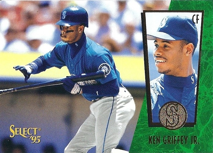
This is probably my favorite of all the Select designs. Cool angular shadowbox with team logo in foil over sweet marbled color field and name below in futuristic font. Everything else on the card is a solid action photo. Bright and fun, simple and attractive, this set offered a high-end look for relatively cheap. I was a big fan when these came out.
I got a box of '95 Select for my birthday one year. I pulled two Artist Proof cards, and yippee! Both were Midre Cummings' Showtime rookie subset card. I finally get a whole box and a guaranteed parallel hit, and I pull two of the same card. Needless to say I pulled hard for ol' Midre to have a ridonkulous season, but it didn't quite turn out that way.
1996:

I think this year's design was even better than the Pinnacle's high-end flagship set. The dark wood grain with gold foil looks warm and rich. You get another nice portrait and another year of solid action photos. Cool inserts, the shiny Artist Proof parallel, and some great photography all combine to make this one of the great unsung and underrated sets of the 90's.
1997:

Select dropped the ball here. They abandoned the ever-improving and unique horizontal layouts for a boring, run-of-the-mill vertical card. This vanilla design is dominated by two-color foil with the name written vertically up one side. The foil team logo and monochromatic mini-portrait are the highlights here, but as a package this layout falls flat.
1998:
 |
| Isn't this sad? |
The '98 set never really happened due to the Pinnacle bankruptcy, but a tiny number specimens from that set did make it out into general circulation including a handful of inserts and a couple of Griffeys. Hence, I couldn't bring myself to put nothing here because there really are a few (20 or less) Griffeys out there in the '98 Select base card design.
I won't go into too much detail here, but I will reveal that having seen the design, I think it was a step in the right direction for the brand. Those that made it out into the world are likely in the hands of supercollectors with far more resources than me; so if any of you super-hooked-up Griffey collectors read this, please e-mail me a scan of card #116 so I can show the nice people. Your secret identity is safe with me.
_______________________________________________________________________________
Thus Select came and went like a fart in the wind, but it did hang around longer than some sets and even managed to produce some memorable cards.
I've said this before about other sets, but I'd like to have been at the design meeting in '97. Such a drastic and terrible change in aesthetic still makes no sense to me. Then again maybe this set was trying to carve out a niche in the market that just wasn't there.
Here's every Select base card design in order by year:

I remember ripping packs of '96 Select, that was a legit set. The Kevin Vaughn card was one of my faves, but that Griffey is awesome. Wasn't a huge fan of the '93 set, but I really liked the "League Leaders" cards they put out.
ReplyDeleteHello my friend! Are you still in on my 2013 Allen & Ginter box break?
ReplyDelete